

Context
IMO Health is a clinical data intelligence company helping healthcare professionals understand complex medical data. They needed their homepage to signal where the company was headed, forward-thinking, AI-driven, and less anchored to the heavy purple identity they had outgrown. All had to be done within 2 weeks.
Role & Contribution
Role
Lead Designer
Contribution
UX Design, Visual Design, Motion Design
I led the visual concept exploration, creating the finalized page design. I also contributed to the motion design for graphic elements and building page sections.
Problem & Opportunities
AI story untold.
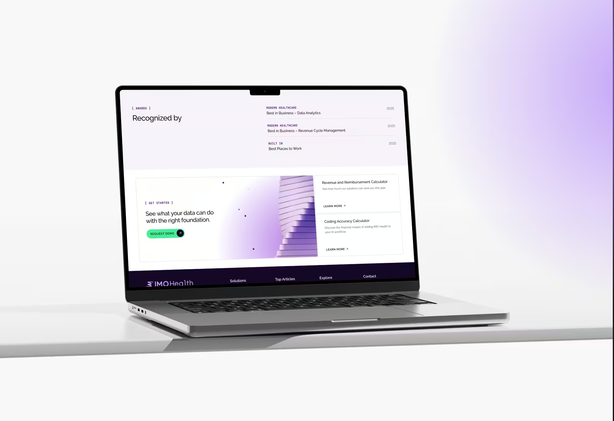
The homepage did not read as an one for an AI-forward company. The opportunity was to evolve the visual identity to match where the business was going without abandoning the existing site entirely.
Heavy, dated color palette.
A dominant purple palette made the site feel heavy. Lightening the color direction could make the brand appear more contemporary with room for content to breathe.
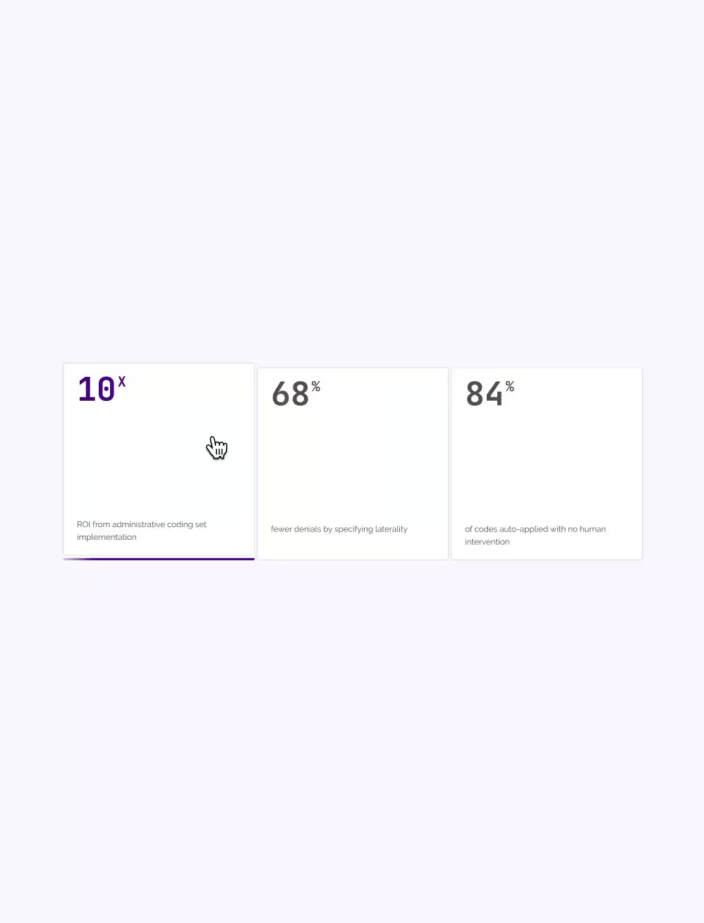
Busy product graphics.
Existing product visuals were too busy and failed to communicate what the platform actually did. The opportunity was to simplify them into something clear, then layer in animation to bring them to life.
Solutions
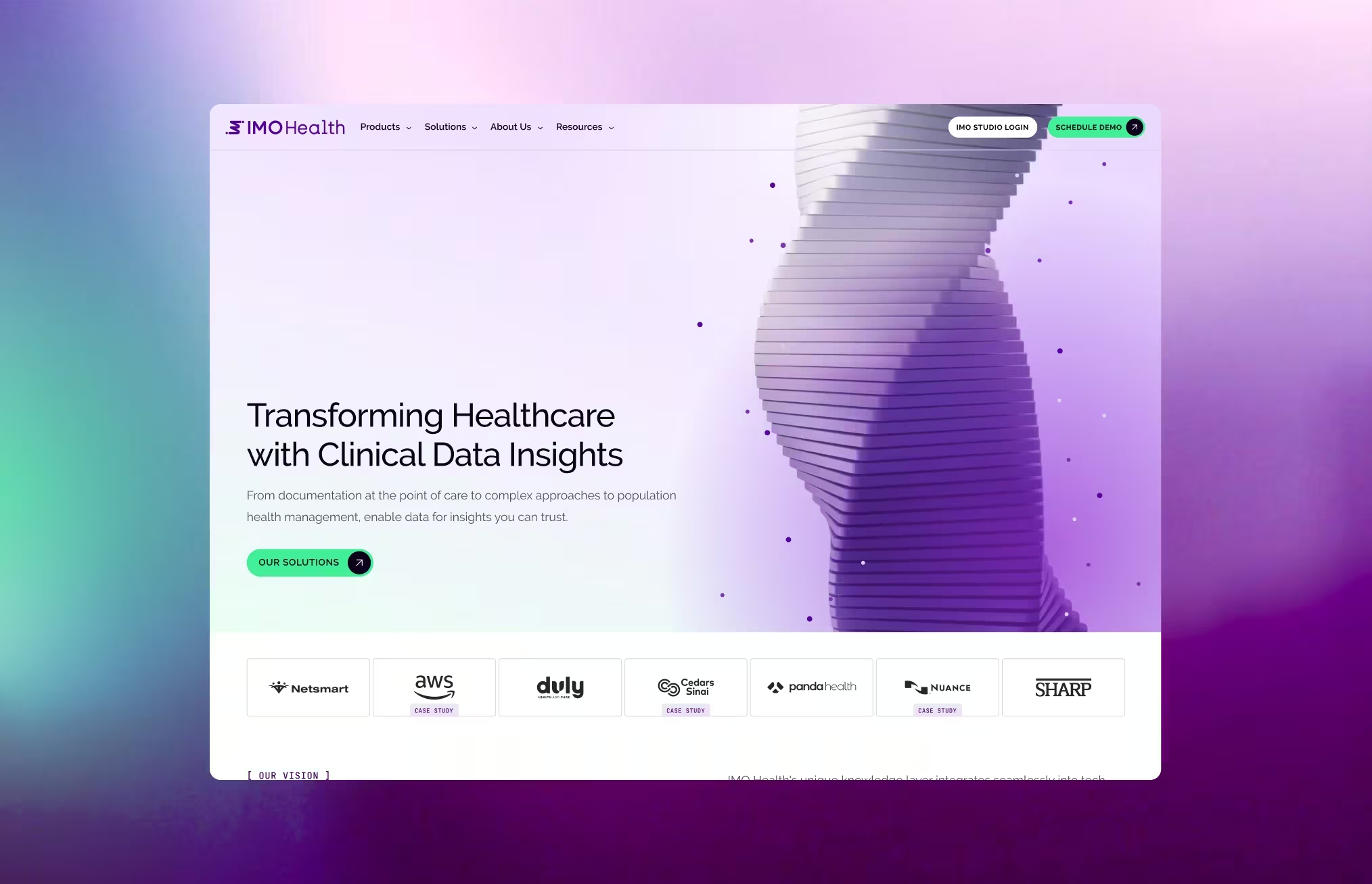
AI-forward hero concept.
Hero concepts explored how to represent complex data movement in a way that felt intelligent and alive. The chosen direction used a helix structure as the visual anchor for the brand's AI capabilities.
Three.js helix animation.
Working with our engineer, we set up an environment to experiment directly with the helix in three.js, adjusting how it looked and moved in real time. The engineer then adapted it for Elementor, which doesn't natively support three.js animations.
Simplified product graphics.
Existing product visuals were stripped back to their essential message first, then rebuilt with animation using Google Antigravity, Claude Code, and Runway. A workflow that previously required After Effects was accelerated without sacrificing quality.
Reflections
Two weeks forced a level of decisiveness that longer timelines often don't. Concept exploration, engineering collaboration, and final implementation all happened in parallel rather than in sequence. The client was impressed with what came together and proved that constraints can sharpen a process faster than almost anything else.