NJASAP App Redesign
Rebuilding a union app from the ground up to get 3,700 pilots informed, connected, and engaged.
Rebuilding a union app from the ground up to get 3,700 pilots informed, connected, and engaged.
Project Type
Product Design
App Design
Role
Designer
Contribution
UX Design
Visual Design
System Design
Team
Designer - 1 (Myself)
Engineer - 1
Project Manager - 1
NJASAP's flagship app is the primary channel through which over 3,700 union pilots stay informed on contract updates, access union resources, connect with fellow members, and get critical support. However, an outdated visual design made it feel less credible than the union it represented, and a navigation structure that buried key features meant members were routinely missing on content they needed.
Company
The NetJets Association of Shared Aircraft Pilots (NJASAP) is an independent labor union for pilots employed by NetJets, the world's largest private jet company.
What I Did
I led the UX and visual design for the app redesign, building a new token-based design system from scratch, restructuring the information architecture, and working within the constraints of the React Native migration.
Highlights
3.7
App Store rating
an increase from 2.9, reflecting improved member satisfaction
50k
active conversations
post-launch activity levels reflecting reduced friction in reaching the messaging and forum features.
"The work was performed impeccably and proved tremendously popular with leadership, members, and staff alike. Exceptional project management, flexible assistance, and constant communication contributed to a rewarding partnership."
Elizabeth Lykins • Executive Director, NJASAP
The existing app had two compounding problems that fed into each other.
An outdated visual design
Members who opened the app expecting a reliable, well-maintained resource were met with an interface that felt neglected. That perception had a direct impact on whether they came back.
Years of accumulated confusion
Over time the app had grown without a design system or clear information hierarchy to govern it. Unused functionality made for a cluttered experience that meant the app required higher effort to use.
Deprecated infrastructure
The app was built on Xamarin, a platform that had reached end-of-life. Migrating to a modern foundation, meant understanding a new environment and the design tradeoffs that came with it.
Research for this project came primarily from NJASAP leadership rather than direct member interviews. Leadership had a clear picture of where the app was falling short, drawn from member feedback they had collected over time and their own firsthand experience with the support requests they fielded regularly.
From these conversations, we gained further insight into our main challenges.
News and contract updates were the main reason pilots opened the app, it needed to be the fastest path from launch.
Forum and messaging weren't failing because pilots weren't interested, they were too buried to reach habitually.
The Steward on Duty was vital for when critical time-sensitive issues arose for pilots.
Without direct access to usage analytics, the old app itself became a primary point of research. Walking through screens with stakeholders made issues apparent and gave us a shared, concrete vocabulary for what needed to change.
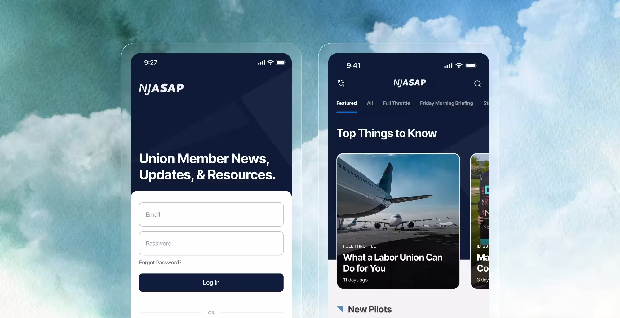
The navigation fix was the structural decision that everything else followed from. Replacing the hamburger menu with a bottom tab bar meant making explicit decisions about what the app was fundamentally for and which features deserved to be permanently visible to every member. It was a union resource, not a utility meant for flight navigation.

The main pathways determined for the app.
The decision to keep a residual Menu tab was practical. A significant portion of the app's content lives off-app entirely, linking out to the website due to scope and time constraints. Rather than scatter those items across primary tabs where they'd dilute the hierarchy, grouping them together in Menu gave members a logical place to find them without making them feel like first-class features they were expected to use regularly.
Within each tab, the IA work continued. The newsfeed, for example, previously displayed news categories through a dotted slider navigation that was easy to miss and hard to use. We replaced it with a clearly labeled horizontal category bar at the top of the screen, making it immediately apparent that content could be filtered and browsed by topic.
Design System
Before touching individual screens, I built a token-based design system for the app: color, typography, spacing, border radius, and more. NJASAP had no existing system to build on, so this was built from scratch.
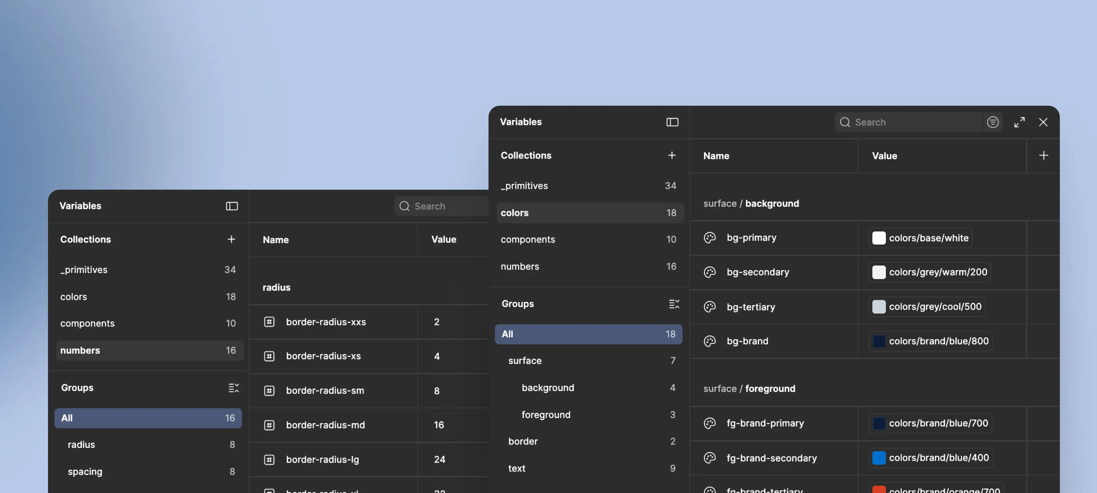
The token system set up for the app.
The system served two purposes beyond visual consistency. It gave the engineer a clear reference for implementation, which reduced back-and-forth during build. And it established a foundation that could support future features without requiring design decisions to be relitigated from scratch each time.
Working within Apple's Human Interface guideline shaped specific decisions throughout. Aspects like hit target sizes, safe area margins, font size minimums, and reachability all informed layout choices across every screen. Where we couldn't follow HIG strictly, the engineer flagged limitations in the app's existing infrastructure early in the process. Modal patterns, for example, had to be adapted to work within what was already built.
Newsfeed and Navigation
The newsfeed was the app's most important screen and the one that needed the most structural work. The old version presented news in a single undifferentiated feed with category filtering hidden behind the slider navigation. The redesign surfaced categories as a persistent top bar, making content browsable at a glance.
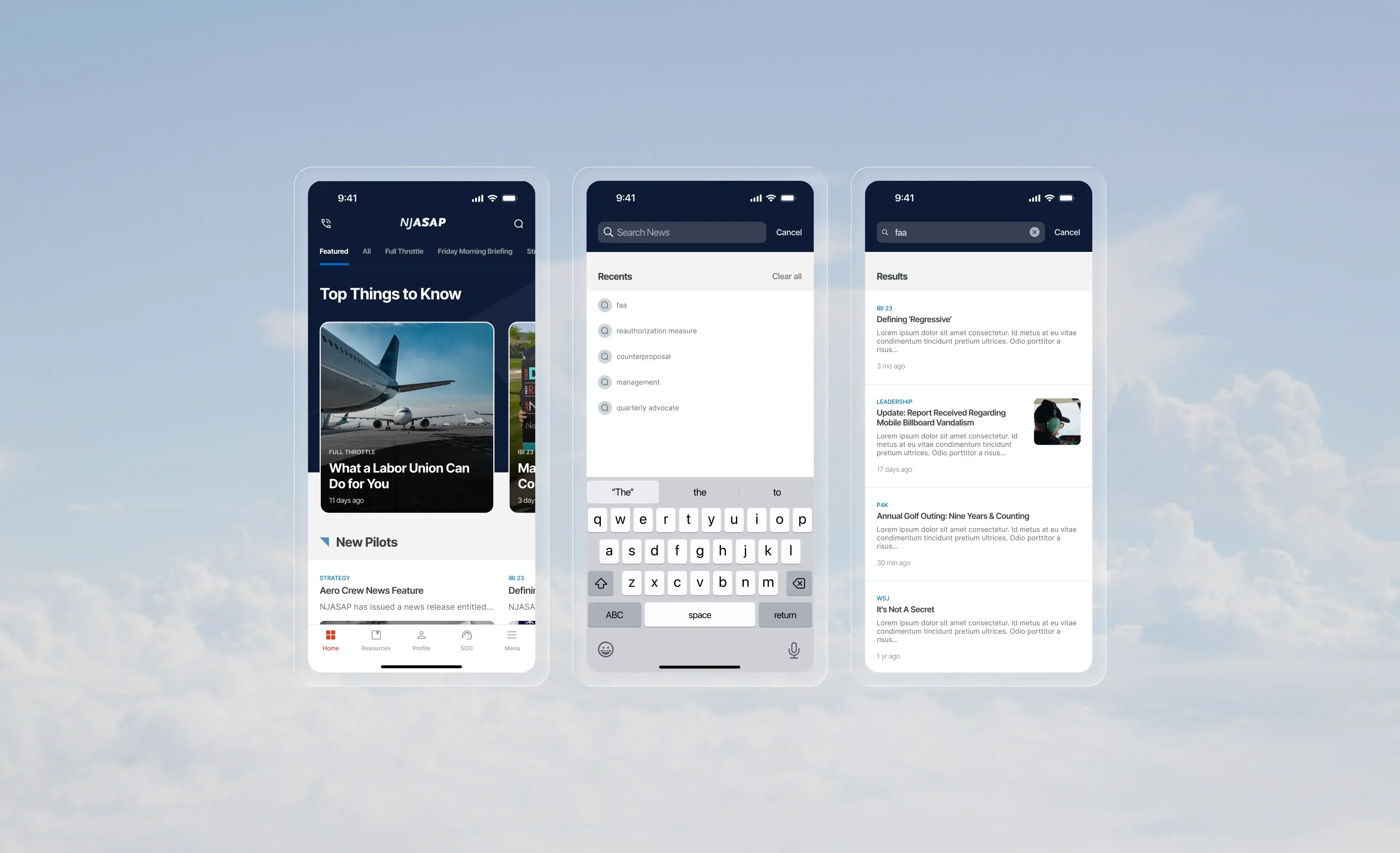
Bottom tab bar and category navigation replacing the original hamburger menu.
Featured stories were introduced to give editors a way to surface the most important content at the top of the feed regardless of publish date. Custom news collections gave members a way to follow specific topic areas, laying the groundwork for new collection types as the platform grows.
The search, which was previously not clearly discernible, was made more readily identifiable through the use of an icon and prominent placement in the top bar.
Login
NJASAP provisions accounts directly for pilots, so there was no need for a sign-up flow. What the redesign did address was a more subtle problem with how the old app handled authentication.
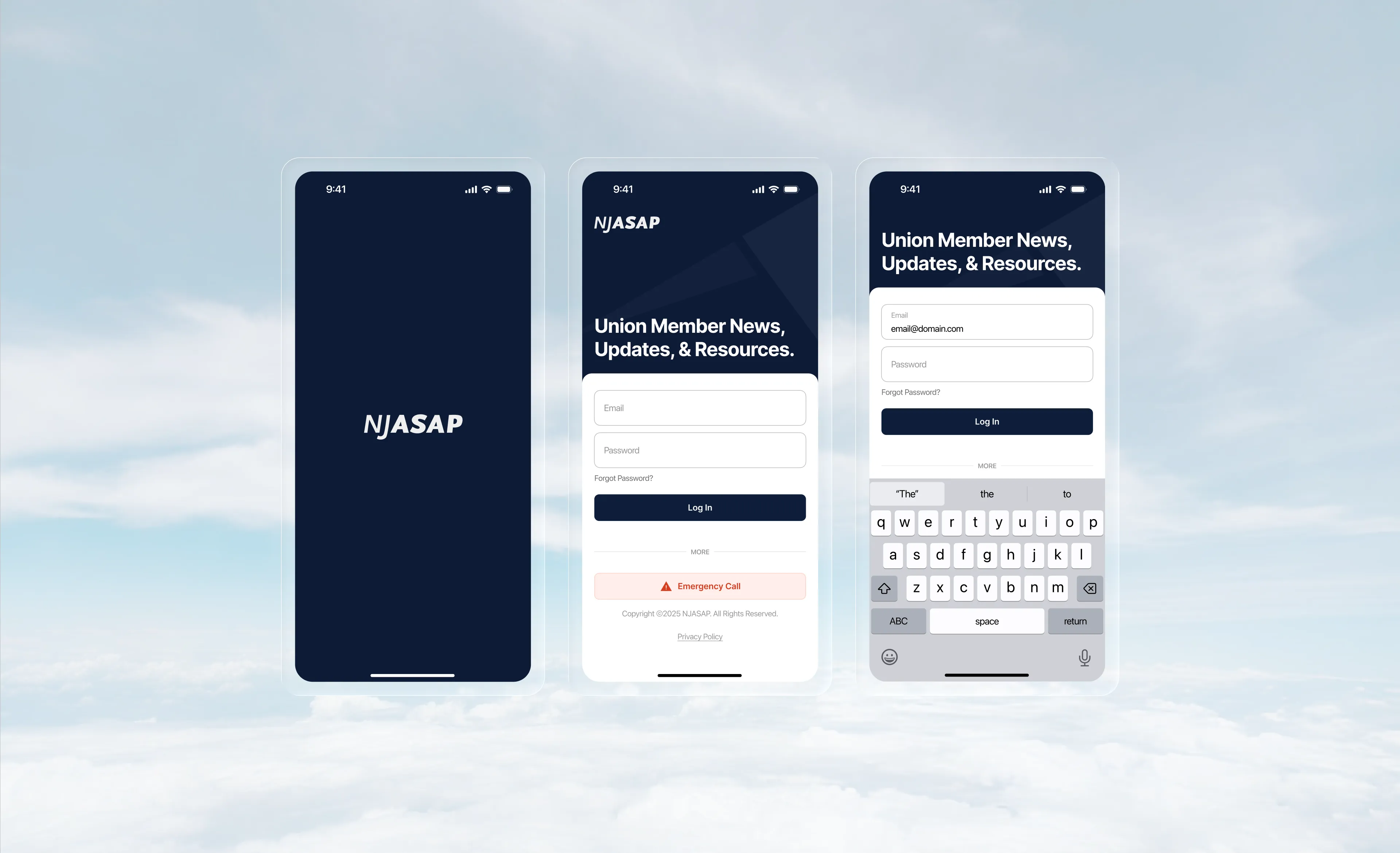
Login-first flow with Steward on Duty as the only pre-auth exception.
Previously, pilots could enter the app without signing in, but most of the content was gated behind a login wall anyway. The result was an experience that let members in only to block them at every turn, making the app feel broken. The redesign made the login requirement explicit from the start. A higher barrier upfront, but an honest one that stopped wasting members' time.
The one deliberate exception was the Steward on Duty emergency contact. Given how time-sensitive that feature is, requiring a login to reach it would have undermined the whole point. It was kept accessible before authentication, the only feature that was.
Additional Screens
The Resources section was reorganized to make union documents and reference material easier to scan and locate. The Steward on Duty screen was elevated to a top-level tab given the time-sensitive nature of the feature: a pilot who needs to reach their steward shouldn't have to dig for it. The Menu tab consolidated the features that didn't fit the primary navigation without burying them entirely.
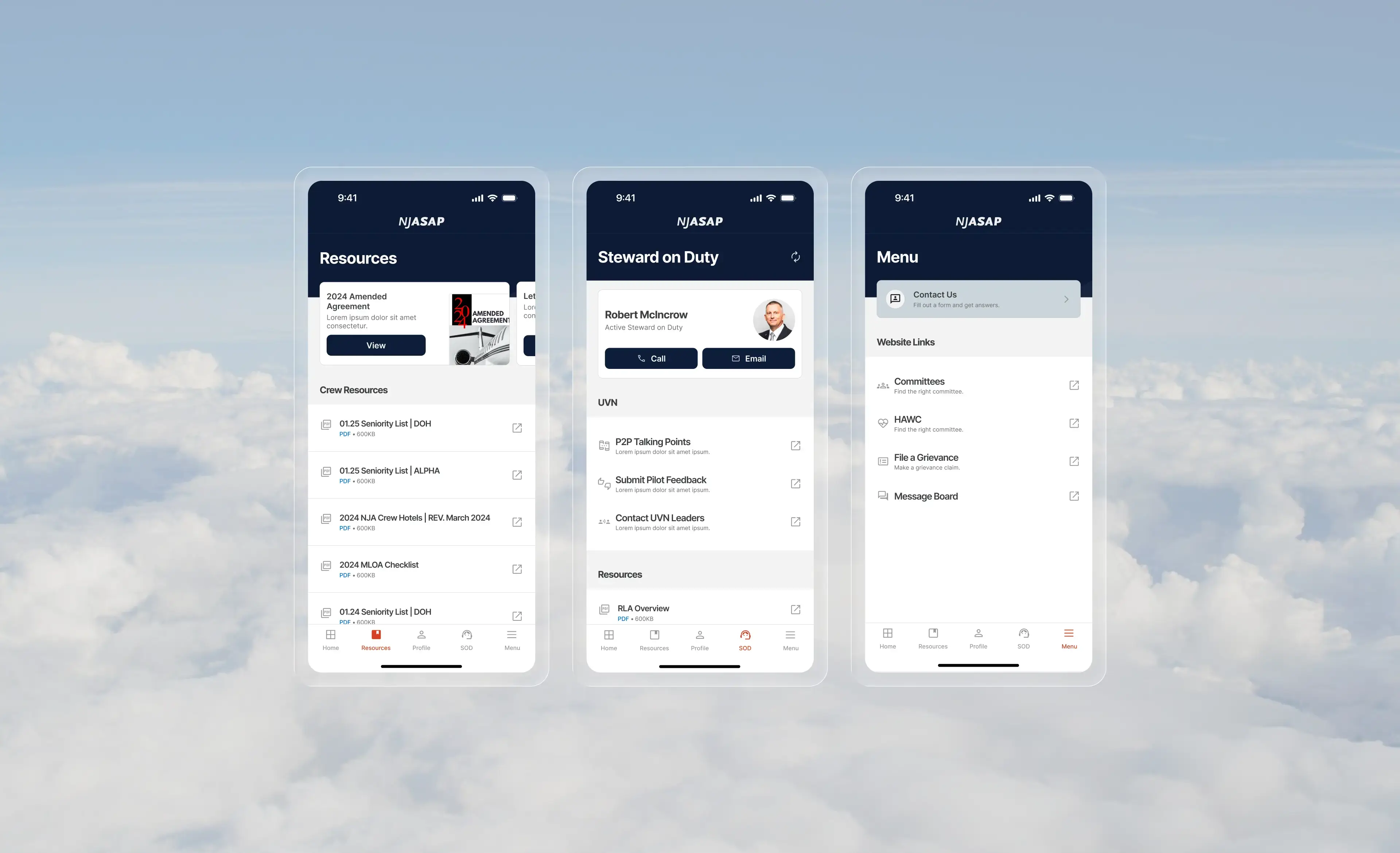
Resources, Steward on Duty, and Menu screens.
Every project leaves you with something you'd carry into the next one. A few things stood out on this one.