Context
NJASAP's app was the primary channel for 3,700 union pilots to stay informed, access resources, and reach their steward. It was running on an end-of-life platform, visually dated, and buried key features behind a non-standard hamburger menu that violated iOS conventions. The redesign moved the app to React Native and rebuilt the experience from the ground up.
Role & Contribution
Role
Designer
Contribution
UX Design, Visual Design, System Design
I created UX and visual design from discovery through handoff, including a token-based design system built from scratch.
Problem & Opportunities
Outdated design.
For a union representing thousands of professional pilots, a neglected interface sent the wrong message. The opportunity was to build something credible that would signal to a pilot they are in good hands.
Years of feature debt.
Features pilots needed most were buried inside a single hamburger menu with no clear hierarchy. Cleaning up unused functionality and restructuring navigation meant rethinking what the app was fundamentally for.
End-of-life infrastructure.
The app ran on Xamarin, a platform that had reached end-of-life. Migrating to React Native gave NJASAP a single codebase for iOS and Android and a maintainable foundation to build on for the future.
Solutions
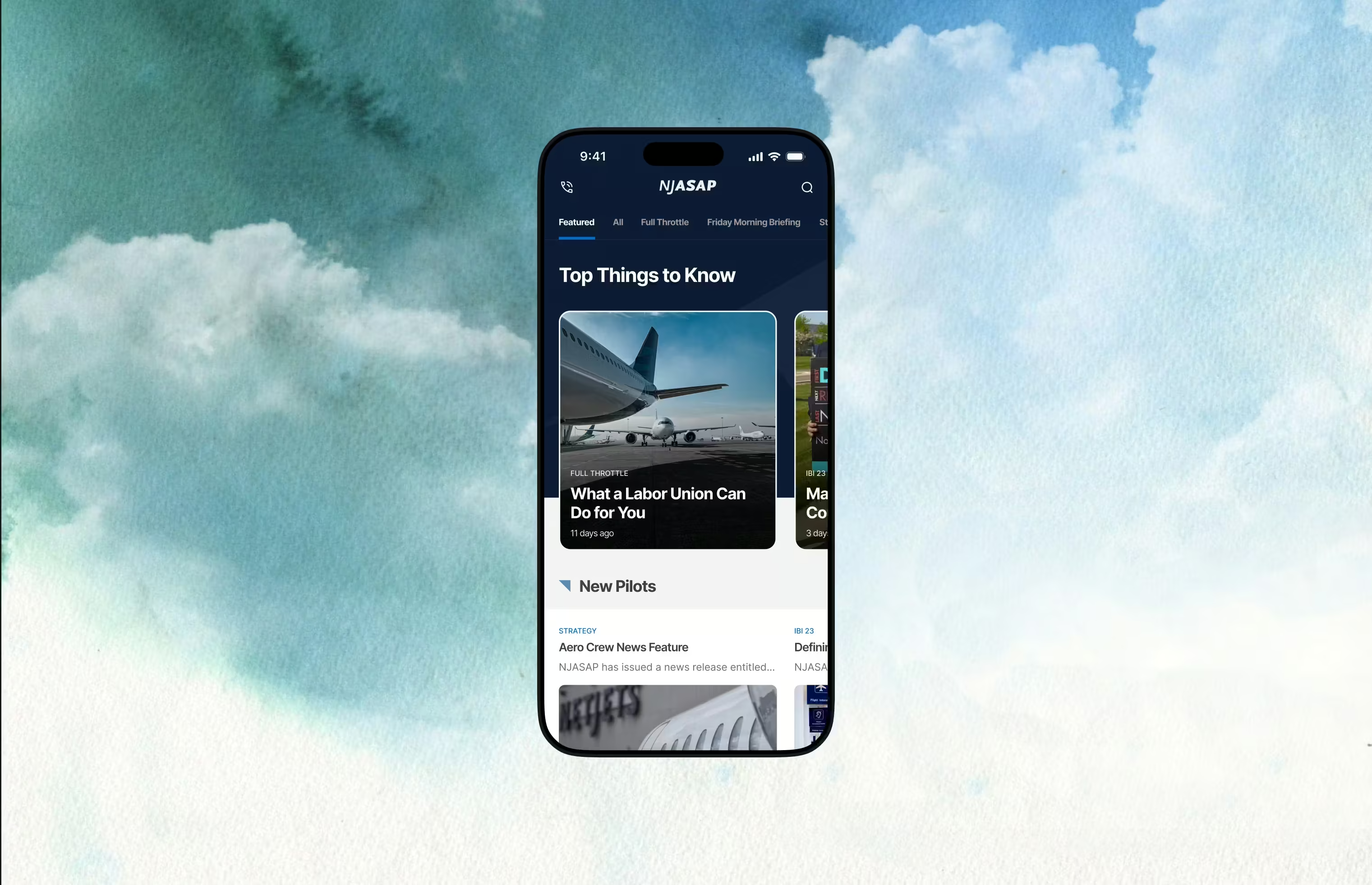
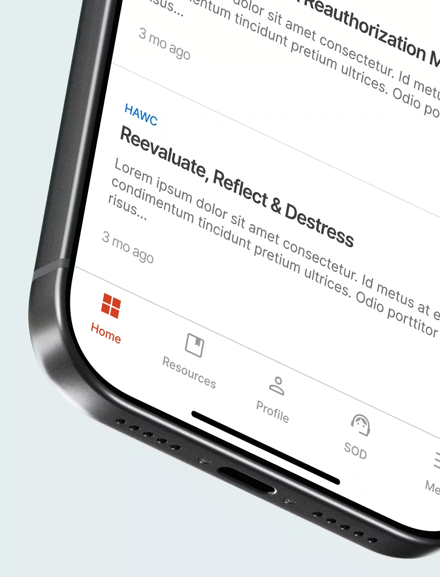
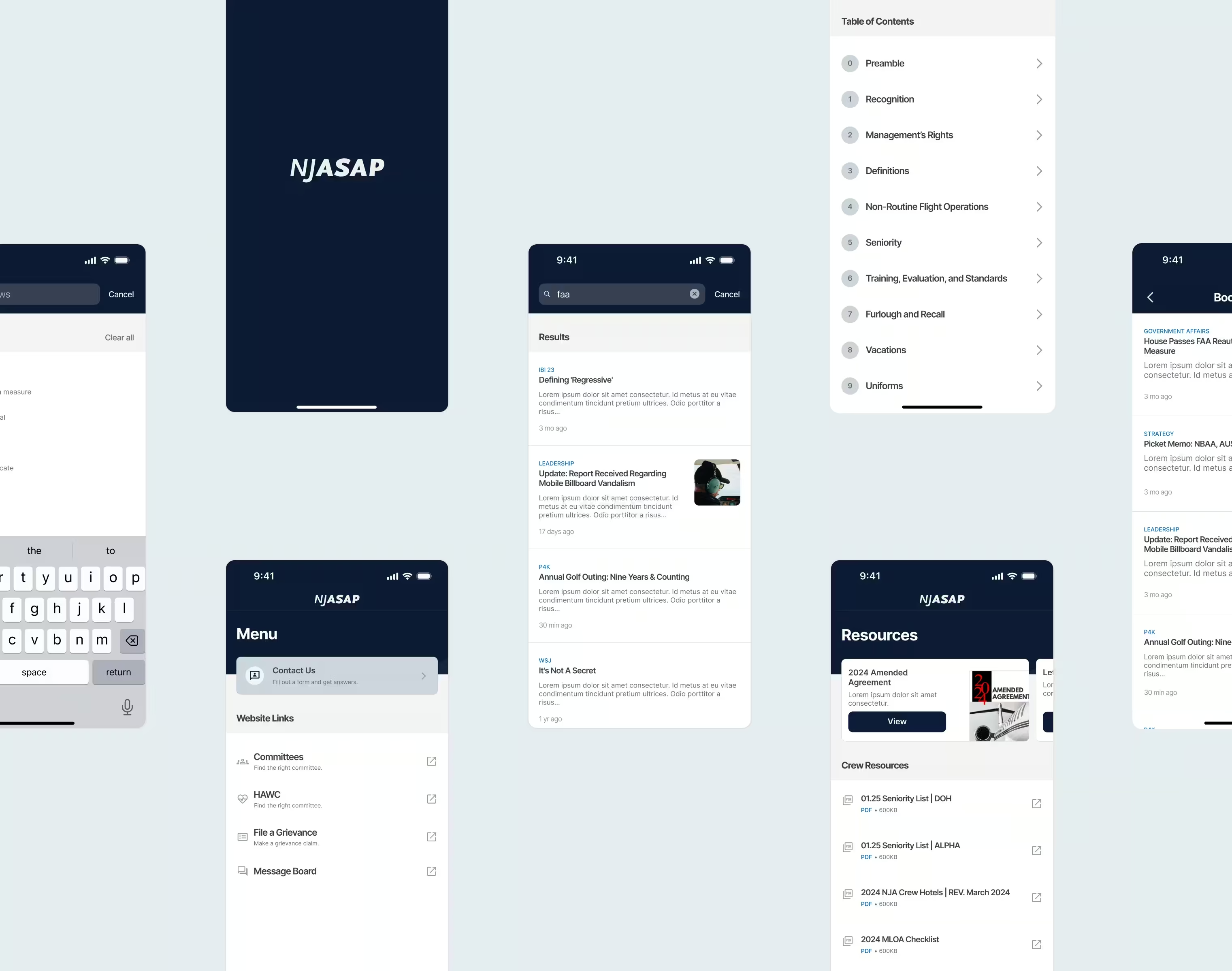
Five-tab navigation system.
Five tabs replaced the hamburger menu, Home, Resources, Steward on Duty, Profile, and Menu. Each reflects how pilots primarily use the app for union matters.
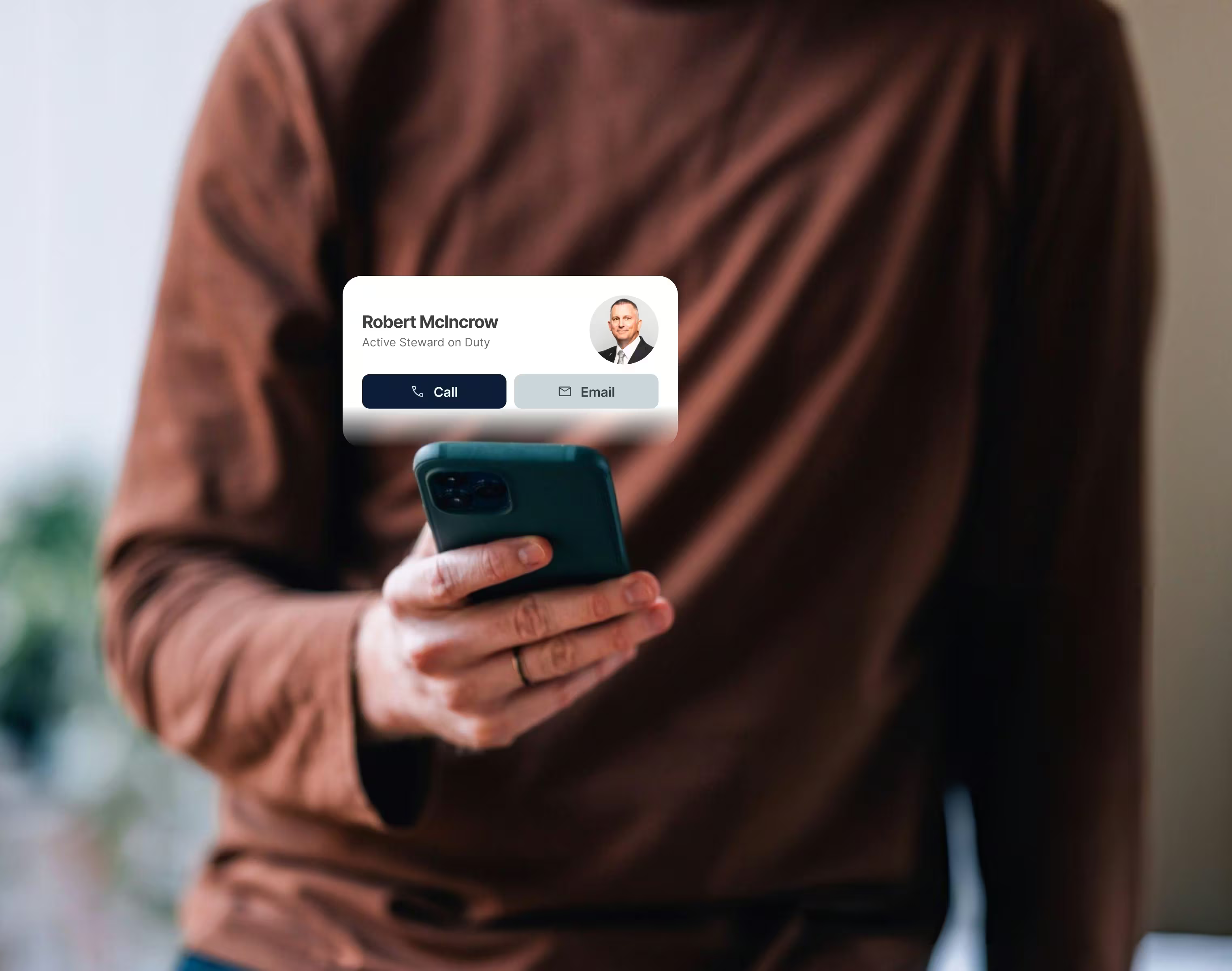
Steward on Duty at the front.
For pilots, reaching a steward is a time-sensitive and frequent action. Burying it behind multiple taps was not an option, so it was given a spot in the primary navigation.
Newsfeed built for browsing.
Categories, search, and bookmarking enhanced a previously undifferentiated feed. Pilots now have multiple avenues for finding the content they need.
Honest login experience.
The old app let pilots in without signing in, then gated content anyway. The redesign, requires login upfront, which while a barrier is ultimately less intrusive post-sign in.
Token-based design system.
Built from scratch covering color, typography, spacing, and interactive states. It gave the engineering team a clear reference and the union a foundation to scale from.
Results
3.0 to 3.7
App Store rating post-launch.
50k+
active conversations post-launch.
The work was performed impeccably and proved tremendously popular with leadership, members, and staff alike.
Elizabeth Lykins, Executive Director
Reflections
Sizing the design system to match the scope was crucial. Building a large robust system for a small team added overhead. Instead, a lean foundation to grow with the product served us better. The same applied to scope overall. Understanding the constraints of the old Xamarin codebase early helped define what work was realistic in this phase.