Context
NJASAP pilots had independently built tools over the years to make sense of their pay, seniority, and schedules. Scattered across separate sites, visually inconsistent, and built without design resources, they were overdue for a proper product. NJASAP brought my team in to consolidate them into one official tool their entire membership could use with confidence.
Role & Contribution
Role
Designer
Contribution
UX Design, Visual Design, System Design
I created the UX and visual design from discovery through handoff, including design system expansion.
Problem & Opportunities
Fragmentation.
Pilots visited multiple separate sites to complete one continuous workflow. To achieve consolidation the information architecture had to be reworked from scratch.
Poor data visualization.
Tools were data-dense but offered little visual context for interpreting what the numbers meant. The opportunity was to make the same data scannable and actionable at a glance.
No official ownership.
Volunteer-built tools led to inconsistent experiences and gaps in coverage. An officially supported product gave us the scope to design for the full range of pilot needs.
Solutions
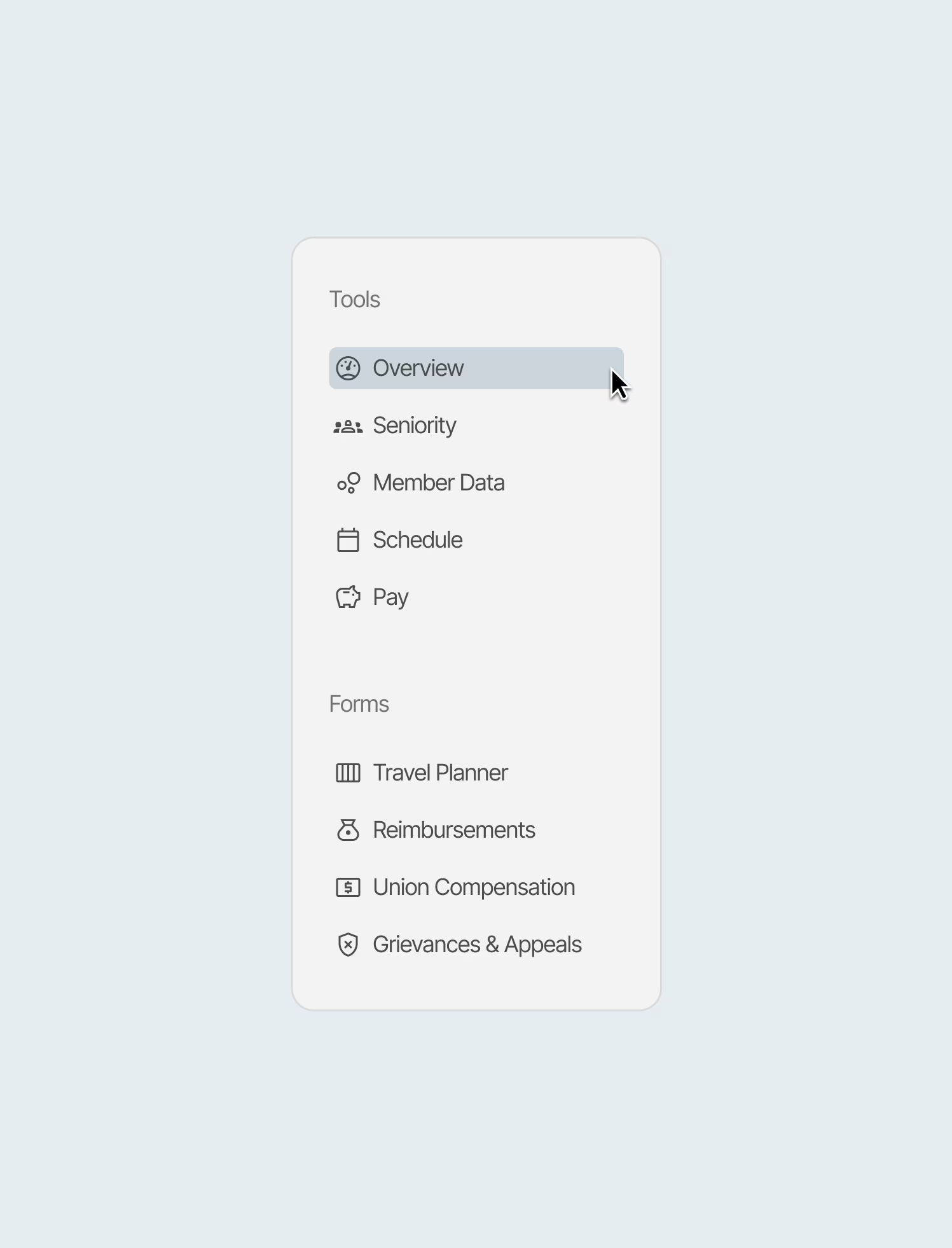
Unified dashboard.
The dashboard organized data to answer key questions including, where pilots stand, who makes up the union, when they fly, and what they earn.
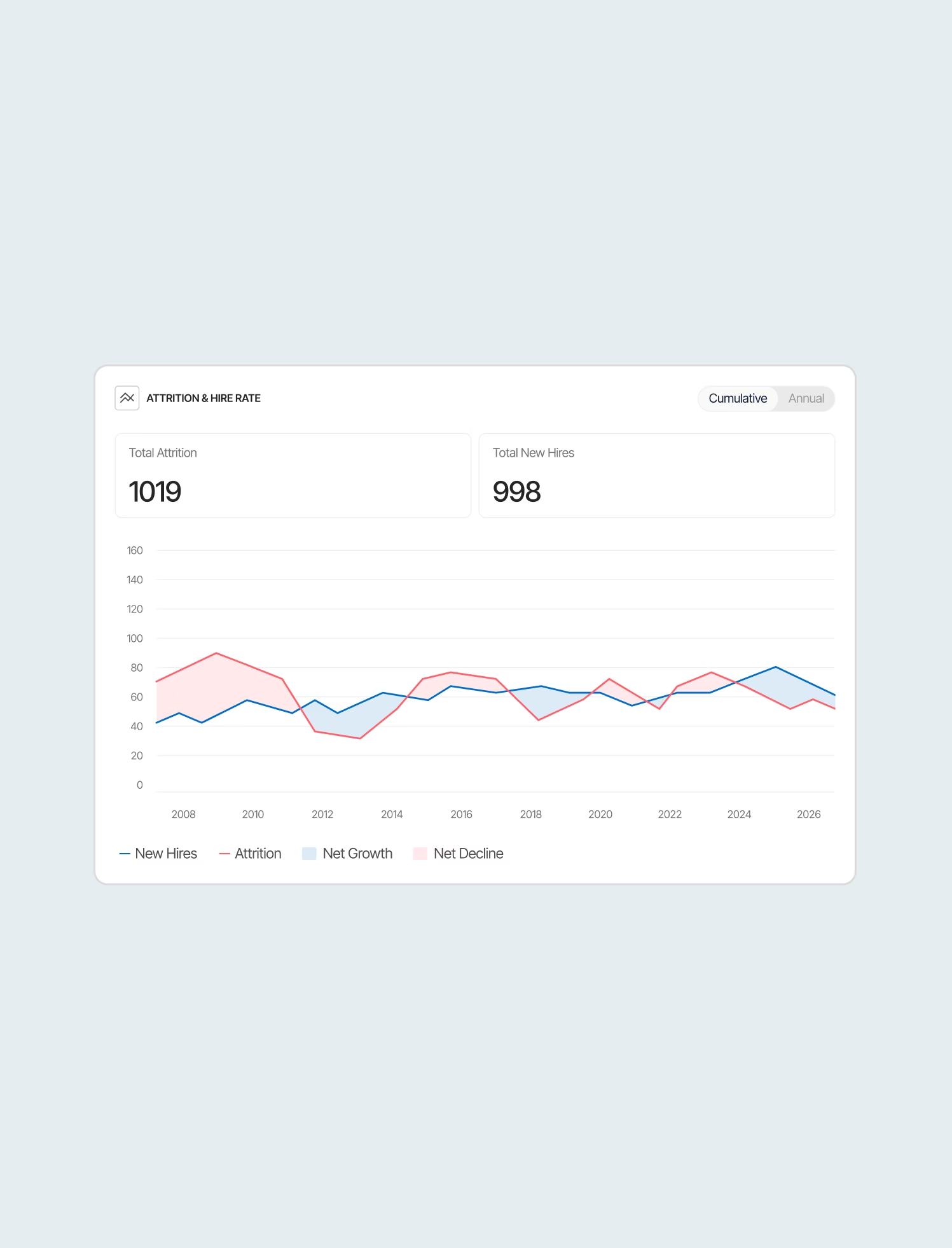
Readable seniority data.
The old tools showed rankings as raw numbers. The redesigned module adds visual context to fleet breakdowns, schedule hold probability, and an attrition view so pilots can see where they're headed.
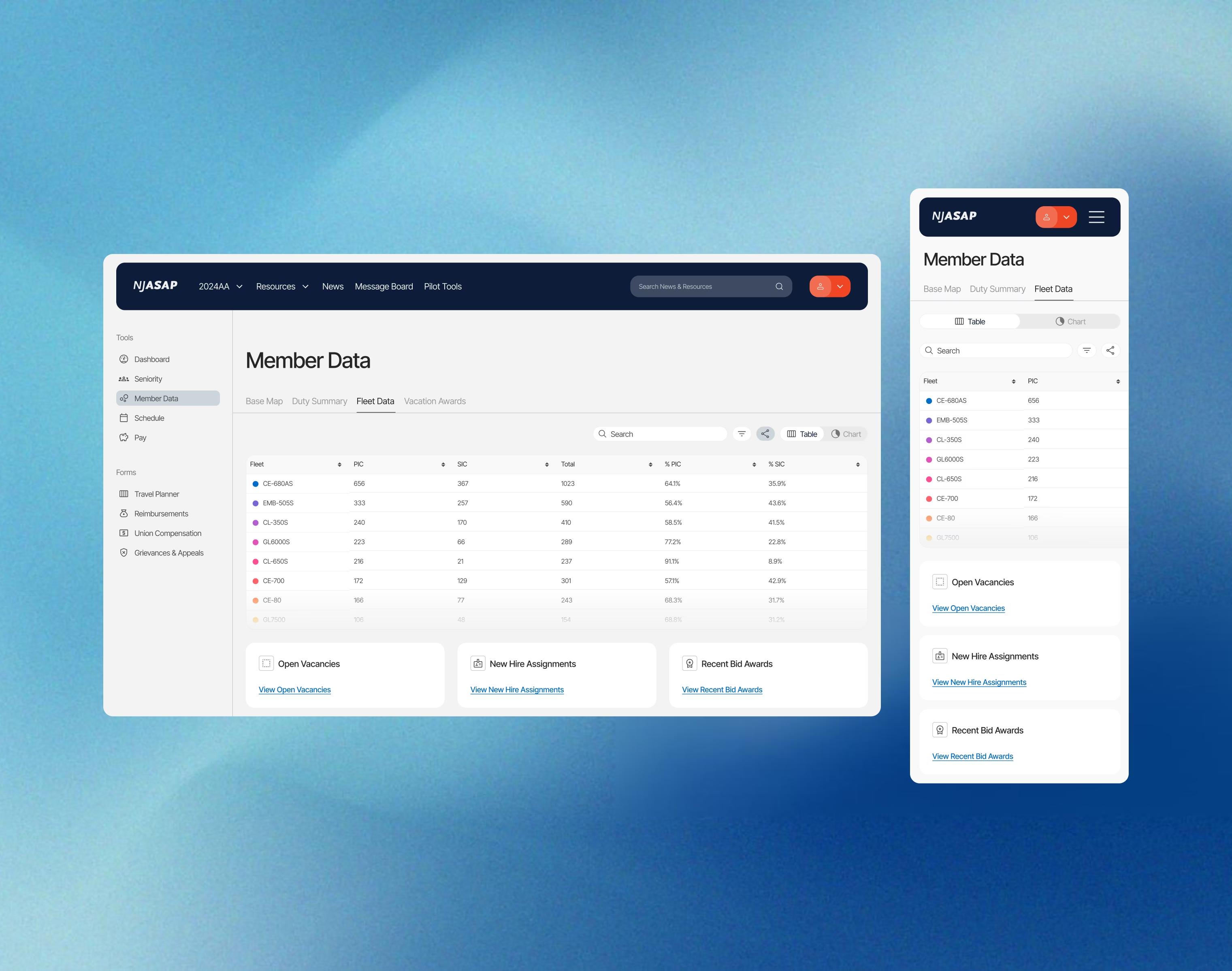
Explorable member data.
Union-wide fleet and schedule data surfaced through interactive charts, with hover states that reveal detail on demand.
Visible schedule seam.
Pilots bid for schedules and often the transition between the two was difficult to see. The seam tool compares the two in a shared calendar, with the transition period marked as a easy to read color overlay.
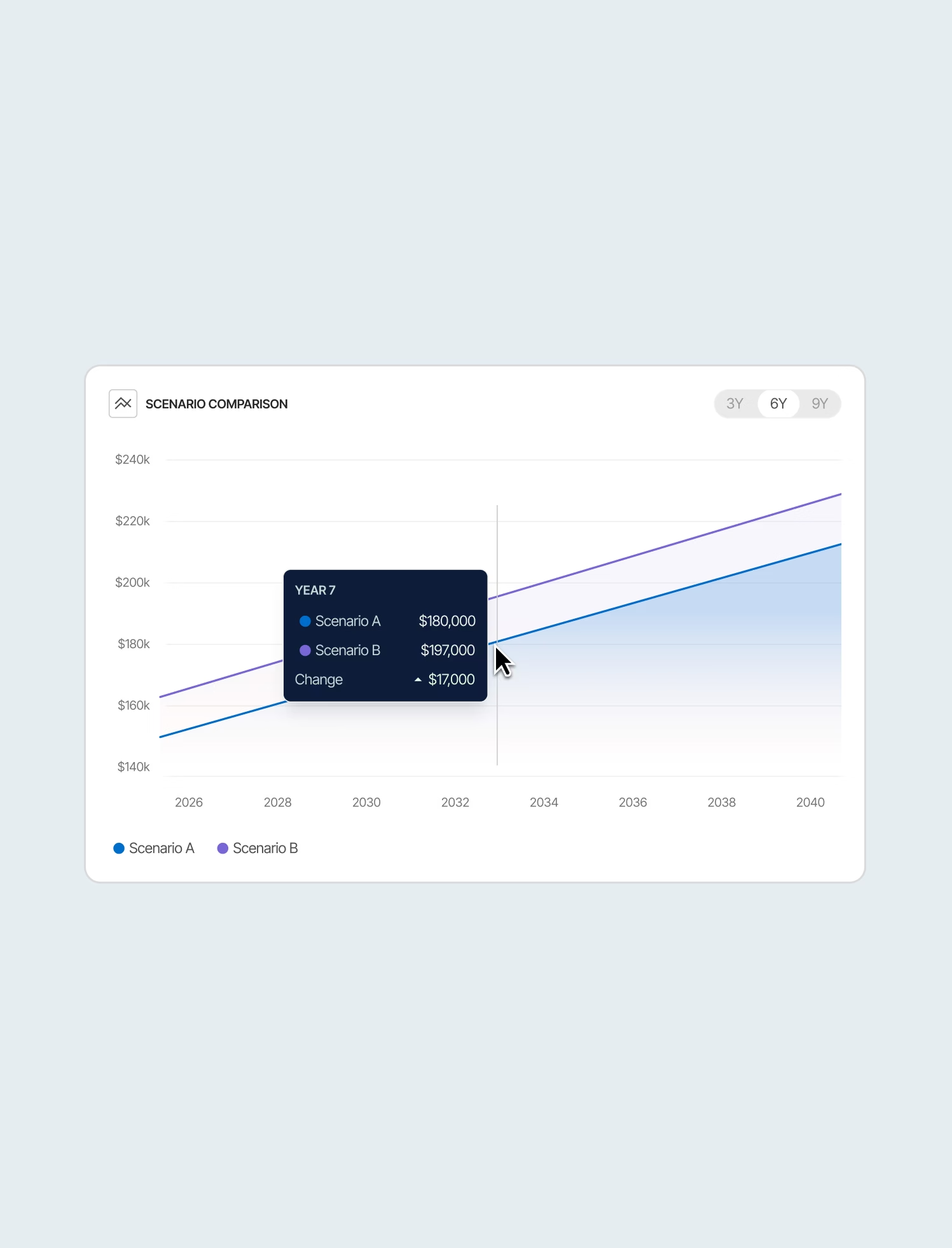
Pay broken down.
Earnings across bonuses, overtime, retirement contributions, and more were made transparent. Plus, a comparison tool for modeling two scenarios side by side was created.
Reflections
Learning how pilot scheduling works challenged even basic assumptions on this line of work. It only came about from slowing down in discovery. Similarly, AI ideation got rough visuals up fast, but it exposed gaps that I had solve slowly and deliberately.