Context
OnBoard is a board management SaaS platform serving 6,000+ organizations across 60 countries. Their site had fallen behind the product, confusing in structure, dated in visuals, and unclear in messaging. We were brought in to realign it around the buyer journey and make the platform's value impossible to miss.
Role & Contribution
Role
Lead Designer
Contribution
UX Design, Visual Design, Strategy
I worked on the UX, and visual design direction from discovery through implementation, contributing to the strategic direction of the site.
Problem & Opportunities
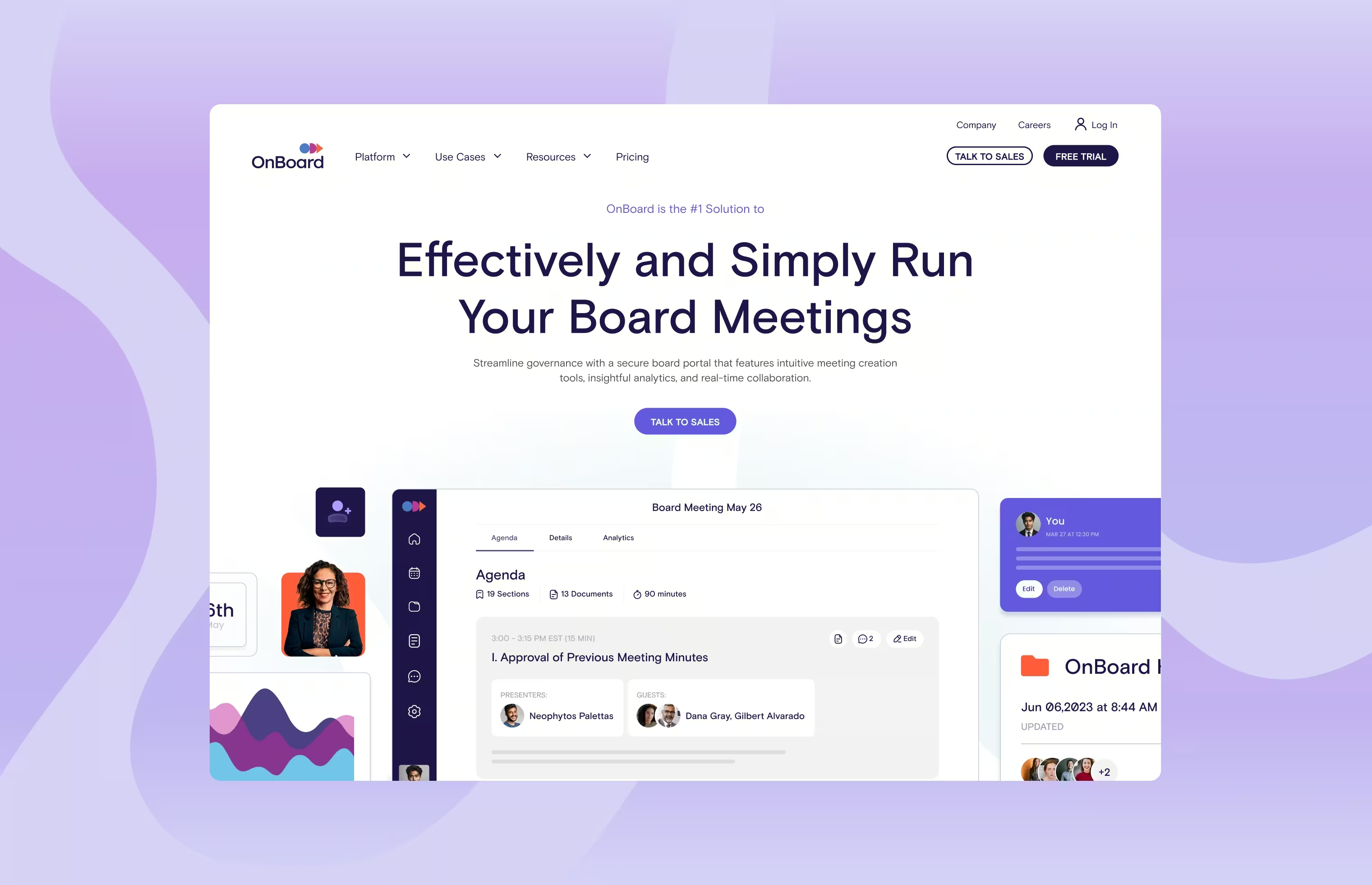
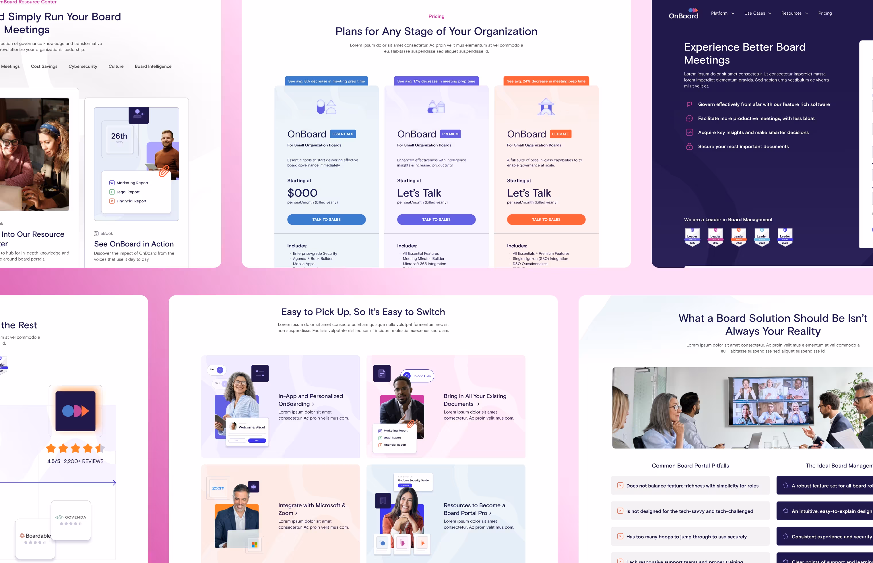
No clear value proposition.
A heavy feature focus meant visitors couldn't quickly understand what OnBoard solved for them specifically. The opportunity was to restructure the site around outcomes and solutions, not just capabilities.
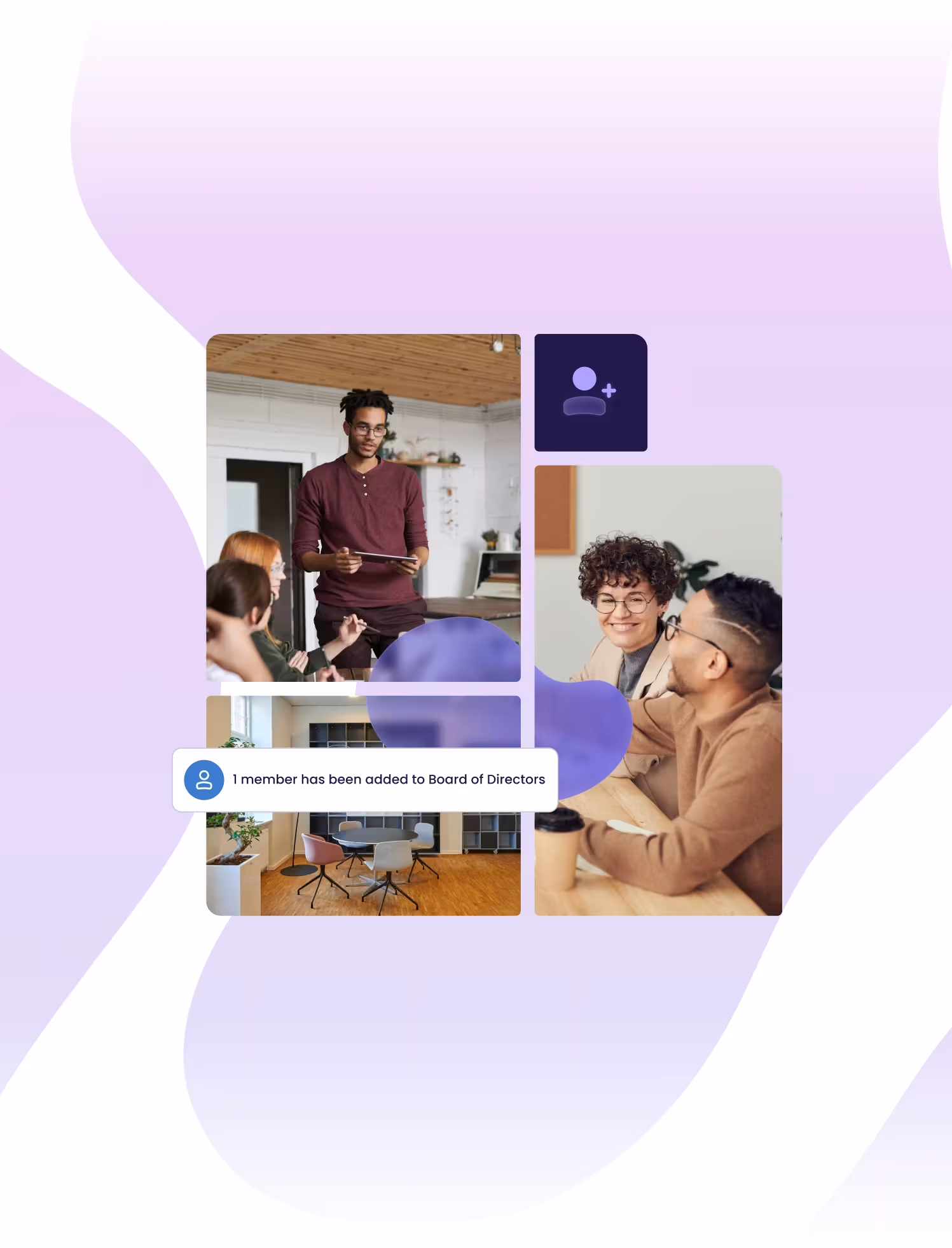
Imagery with no story.
Product visuals lacked cohesion and failed to communicate the boardroom experience OnBoard enables. A stronger visual system could do the work of messaging before a visitor reads a single word.
Complex navigation.
Visitors couldn't easily find where they fit or what path to follow. Simplifying the structure and introducing audience-focused pathways gave different buyer types a clear route in.
Solutions
Solution-driven site architecture.
A new sitemap reduced the number of pathways and introduced a Use Cases section alongside the platform features. Visitors could now self-sort by who they are rather than guessing which feature applied to them.
Composite boardroom imagery.
A new treatment built around combining boardroom imagery with that of people at work told the platform story at a glance. It enhanced standalone photos and gave the brand a distinctive, ownable look.
Energetic visual system.
A revitalized color palette and typography scale modernized the brand and created a secondary function: to separate and distinguish platform solutions across the site.
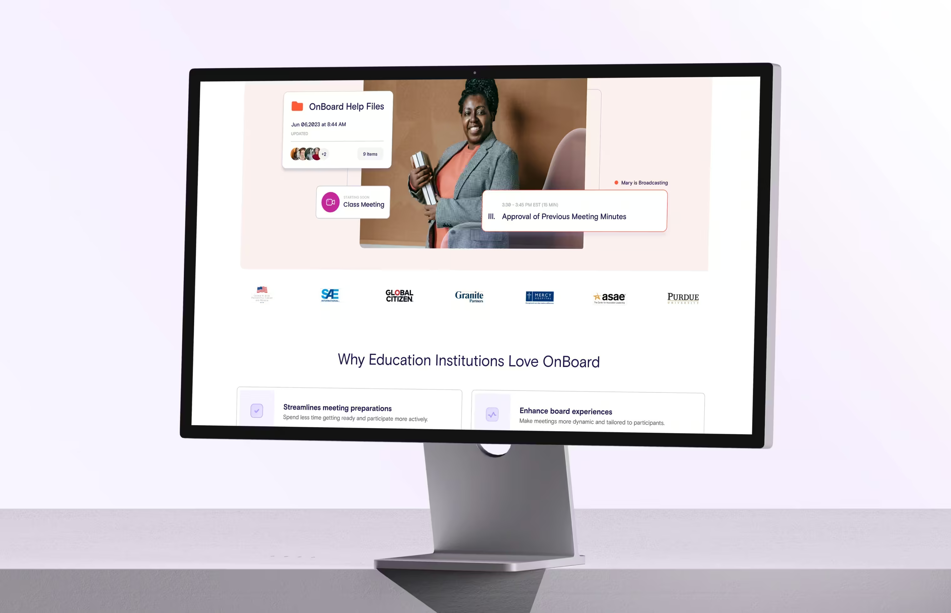
Product graphics to scale.
A library of simplified UI components gave OnBoard a flexible system for building new marketing assets consistently, extending the design work beyond the website launch.
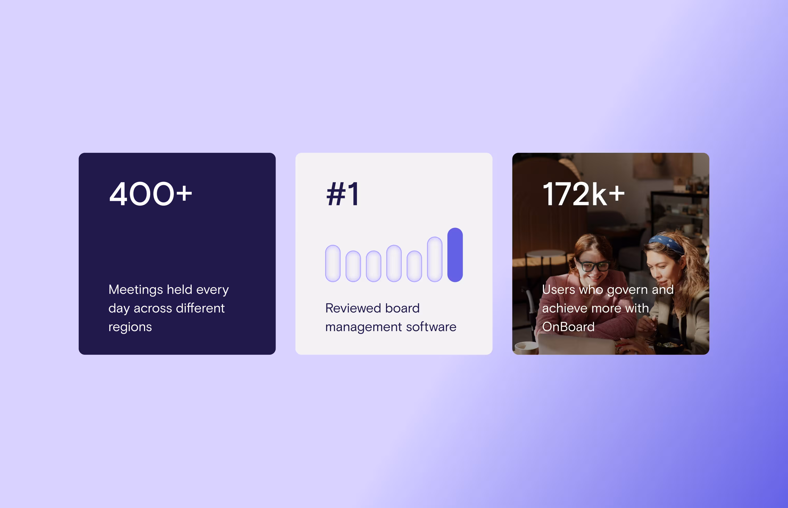
Results
15%
increase in pages visited.
20%
increase in time spent on site.
10%
decrease in bounce rate.
Reflections
The composite boardroom image solved a problem leadership had been circling for a while. They wanted to show an empty boardroom but could never make it feel alive on its own. The composite treatment gave it context and energy, and it became one of the most celebrated parts of the redesign. Sometimes the right visual decision resolves a conversation that strategy alone never could.