
Context
After being acquired by Educational Testing Service (ETS), PSI Exams needed their site brought under the new parent brand. The challenge was translating print-first guidelines into a web-ready system that felt like a natural extension of ETS, worked across every page type, and met modern accessibility standards.
Role & Contribution
Role
Lead Designer
Contribution
UX Design, Visual Design
I led the UX and visual design direction for translating the new brand guidelines to a web format.
Problem & Opportunities
Identity out of step.
PSI's existing visual identity clashed heavily with ETS after the acquisition. Bringing the site in line with the new brand was the first step in signaling a unified organization to visitors.
Guidelines built for print.
ETS brand guidelines were designed for print, not the web. Adapting them for web meant making decisions about color, type, and spacing that the guidelines didn't account for across a full site.
Accessibility left behind.
Over the years accessibility for the existing side had started to fall by the wayside. Meeting WCAG standards while staying true to the new brand created a new set of constraints to solve for.
Solutions
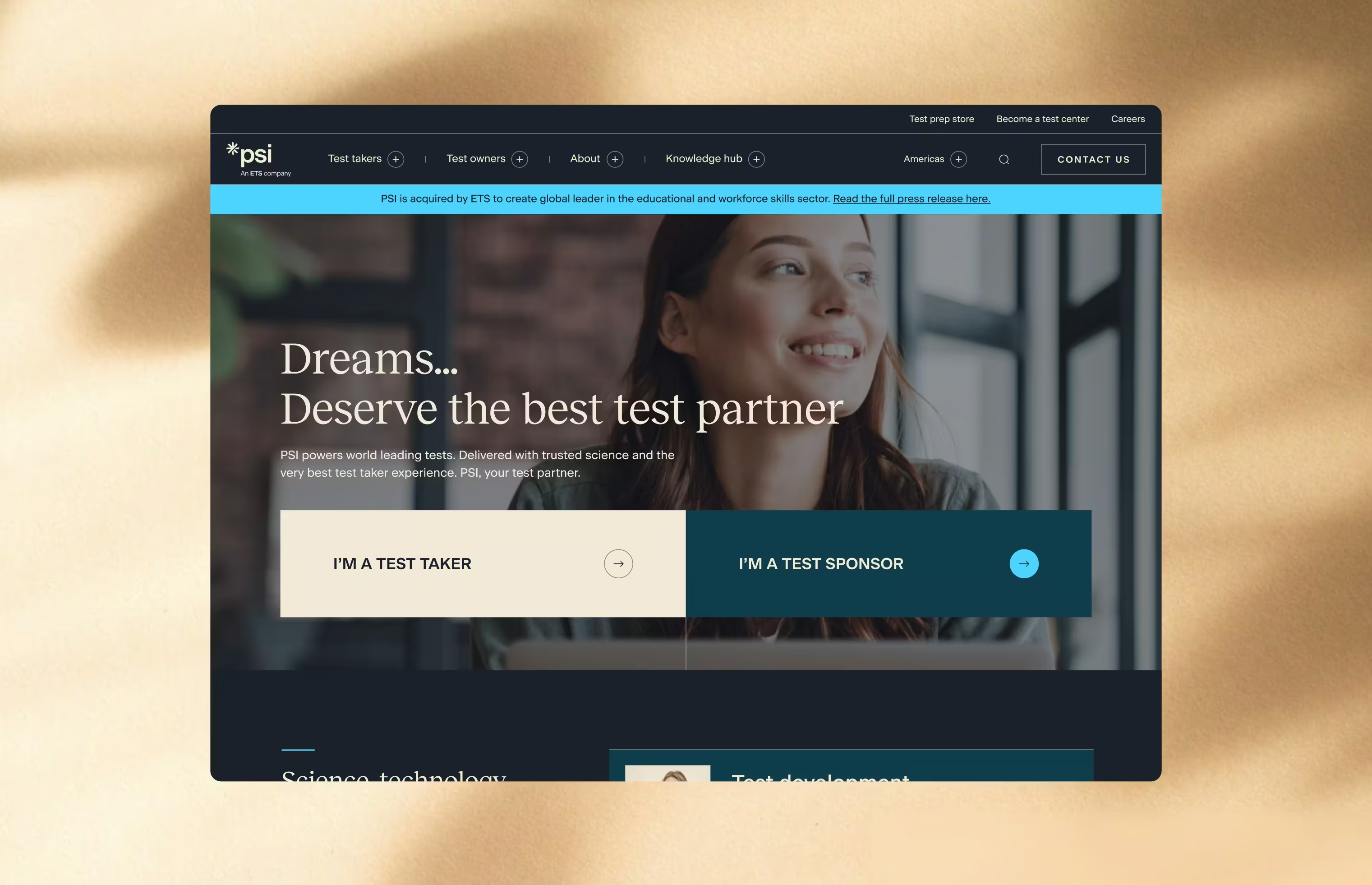
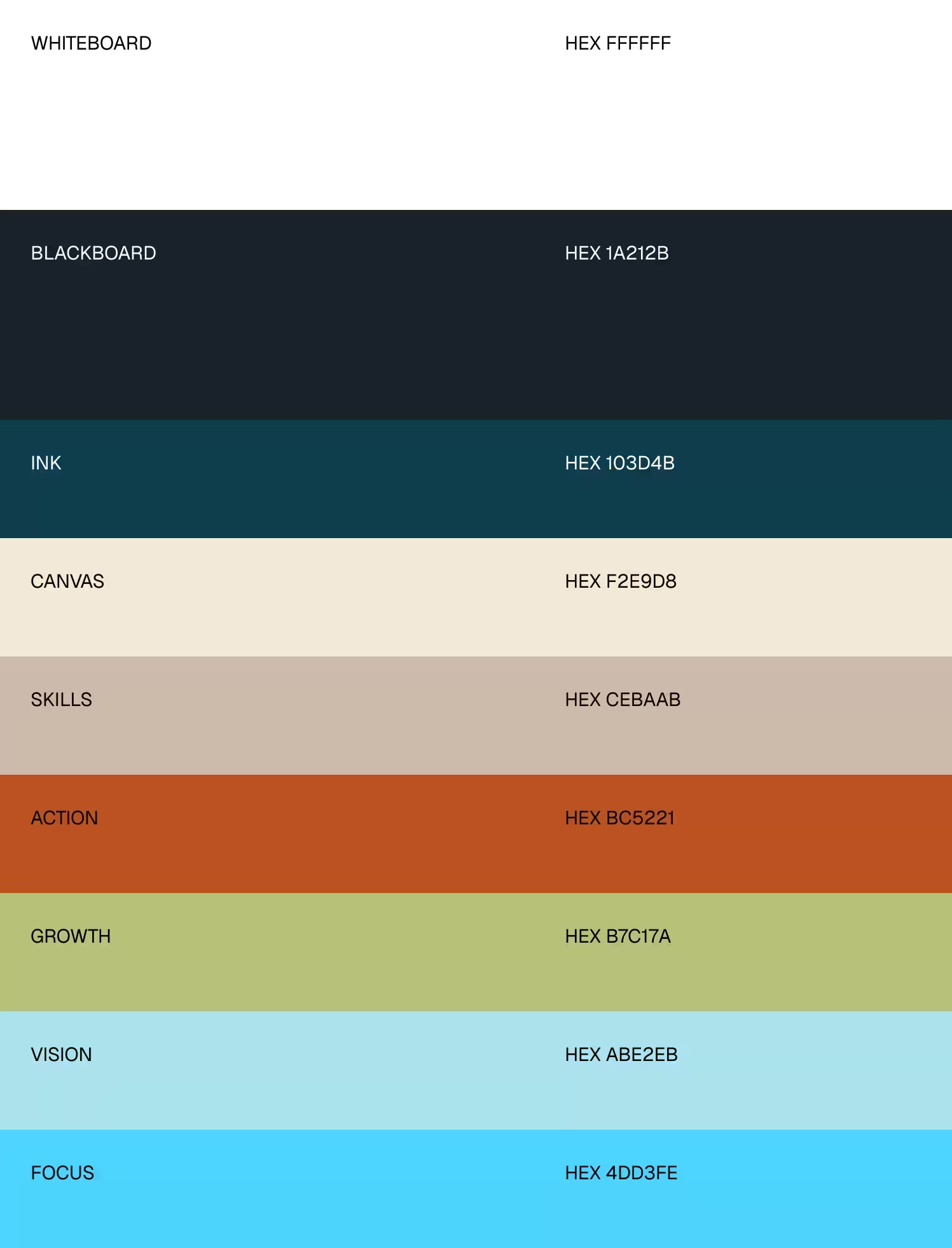
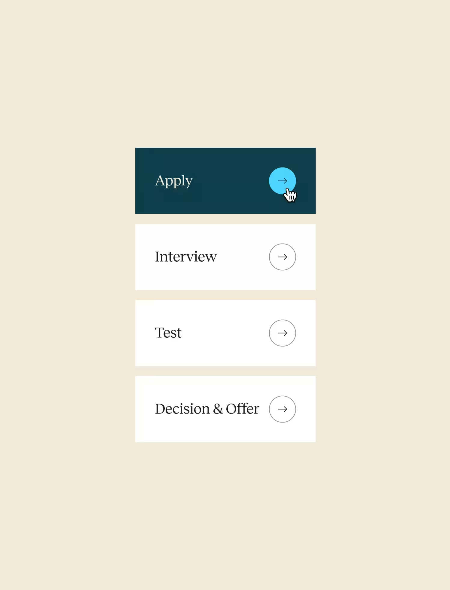
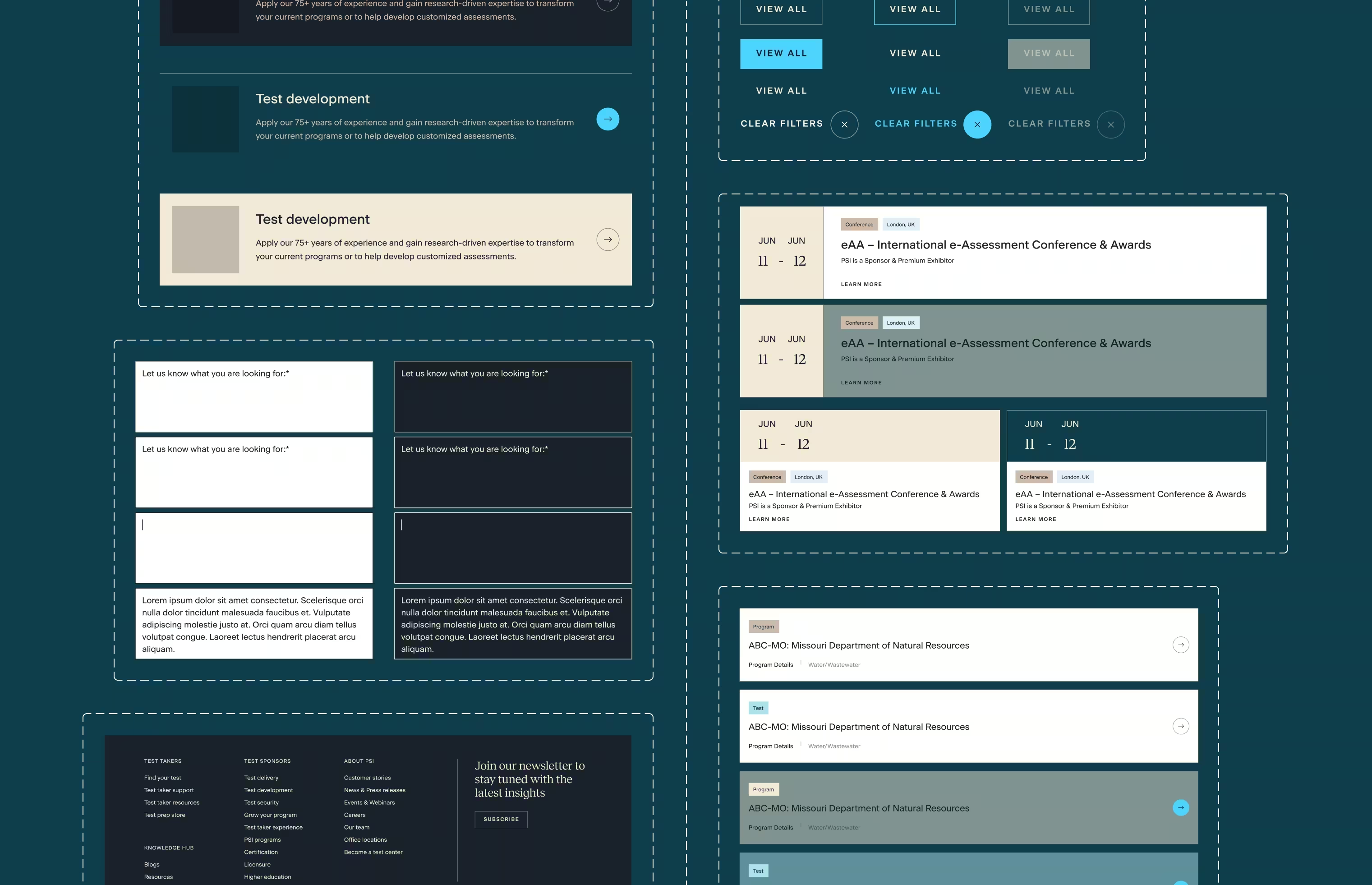
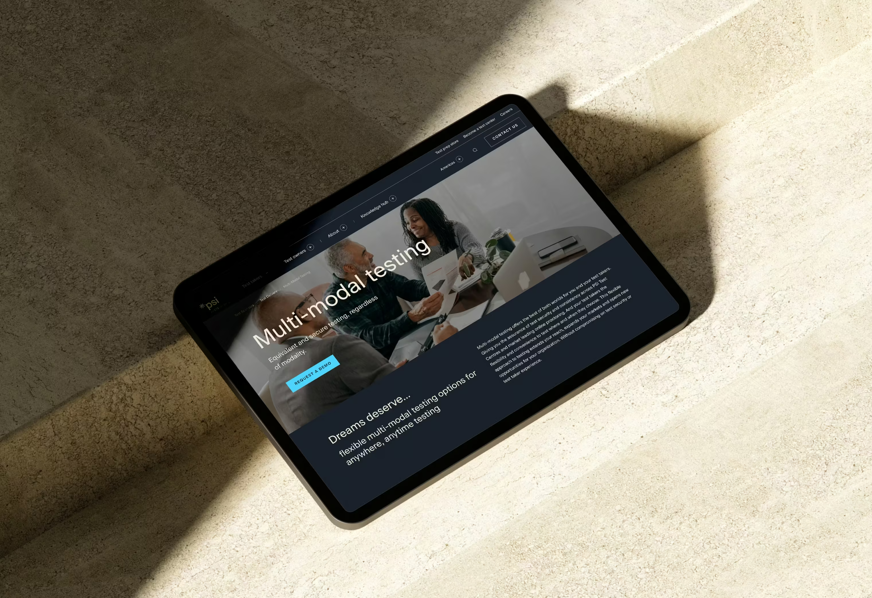
Web-ready brand system.
ETS guidelines were interpreted and extended for digital use, covering color tokens, typography scale, spacing, and component styles across all page types.
Accessibility-first implementation.
Color contrast, keyboard navigation, alt text, and heading structure were all addressed systematically, resulting in a 100 accessibility score in Google Search Console.
Results
100%
accessibility score in GSC.
10%
increase in website traffic post-launch.
Reflections
Brand translation work looks straightforward until you're inside it. ETS gave us guidelines built for print and we had to make them feel at home on the web across dozens of page types and components. The client was receptive to how naturally it extended from what they had shared, which was the goal from the start.