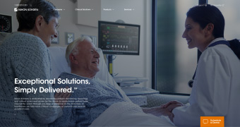
Nihon Kohden America (referred to here as NKA or the client) is a
subsidiary of the Nihon Kohden Corporation Japan, a leading manufacturer, developer, and
distributor of medical electronic instrumentation.
The objective of the website
redesign was to simplify and highlight the company’s medical solutions and products for
patient monitoring, neurology, sleep assessment, and more. On an accelerated timeline, this
project concluded with a design and wireframe created by myself and handed off to the Nihon
Kohden team.
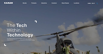
The Nihon Kohden America website is currently under development.
home page mockup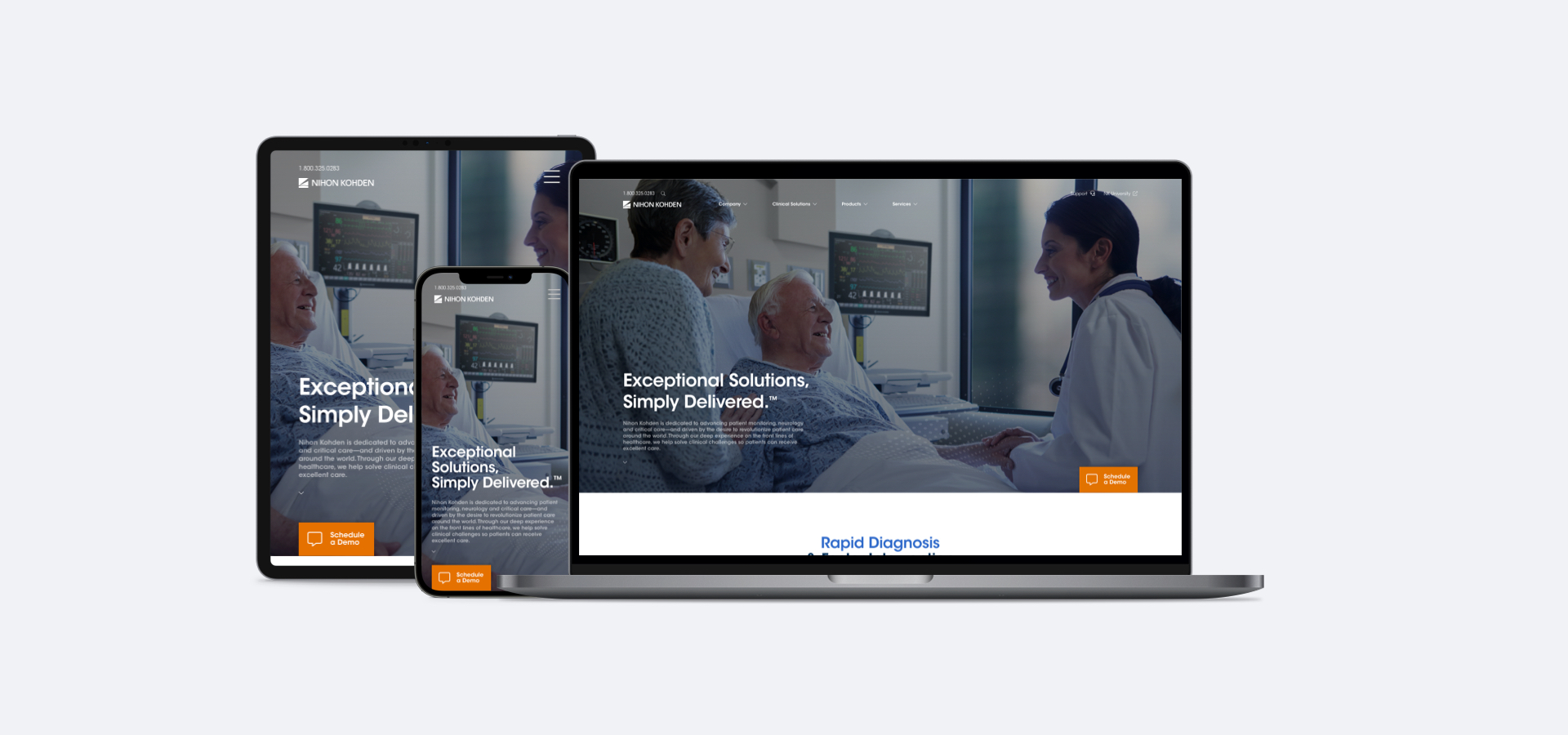

Before the official project kickoff, I prepared a brief SWOT analysis to assess Nihon Kohden’s state as a company and the state of its website. Through this, I formed a preliminary understanding of what the company already excelled at, what challenges it faced, and what a new design could remedy.
Strengths:
Weaknesses:
Opportunities:
Threats:
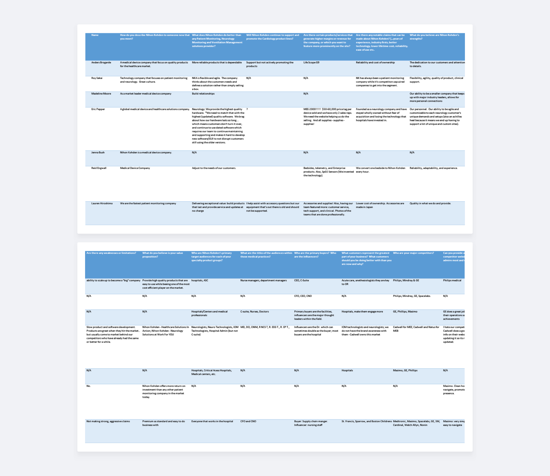
To gather information, an extensive questionnaire was supplied by my
team at SFA Marketing to the client. Questions, formulated from both design and marketing
standpoints, allowed us to gather as much raw directional information from the relevant
departments/individuals at Nihon Kohden. The questionnaire addressed popular products, pain
points in their company, overall value proposition, and more. From the answers I began to
parse what I saw as the key takeaways and findings.
Nihon Kohden’s strength comes from its flexibility and stability, but it can be a weakness.
Durable products with long lifespans are complemented by service and updates provided at no
extra charge. However, durability means customers don’t turn products over and support for
legacy software may often be necessary.
Popular products
Each department had its own opinion on the best-selling products, but across all answers it
was important to give prominence to the products and show the degree of interconnectedness
between not only accessories but clinical areas as well.
Solutions oriented technology centered around simplicity is key
Highlighted among the many responses was the need to communicate that NKA’s offerings were
comprehensive and able to simply integrate into existing workflows in various medical
settings.
A clearer picture of the home page, products, and humanity
A large selection of options clutter the home page and navigating to the interior pages
offers no clear detailed view of products. The backing of human related imagery is also
integral to how they show product use and is not currently communicated.
The questionnaire answers also addressed the key groups served by NKA
as well the competitors vying for the business of these same audiences in the medical
electronics space.
As expected, from both the responses and a sampling of site analytics received from the
Nihon Kohden America team, we saw that a majority of visitors to the site were based in the
United States and involved in the medical field. Groups in that audience ranged from
hospitals, neurologists, and nurses to lab technicians, C-suite professionals, and supply
chain managers.
The intellectual and professional nature of the audience informed the overall approach
(including tone, imagery, etc.) for the proposed site. Displaying product features and
services with no “fluff” and how they related to other products and applied to different
settings was vital. It would allow target groups to quickly determine what products and
services suit their needs best and integrate into their existing environments easiest. This
in turn permits them to return their focus to providing better health outcomes.
Natus, Mindray, Masimo, and ResMed are among some of NKA’s competitors and examining their
websites served to further solidify our approach. A powerful technical mission statement
followed directly by product and service details or descriptions was commonplace. The
messaging accompanied by compelling medical imagery told a story about who these companies
are and what they offer. Layout simplicity varied across the board as to how this was
communicated, but the presence of this message was always a constant.
At this stage, I developed a list of goals that I felt needed to be achieved by my design in order to remedy many of the challenges presently faced by NKA. From there I prioritized what I believed was most important to achieve given project constraints (time, scale, etc.) and they were:
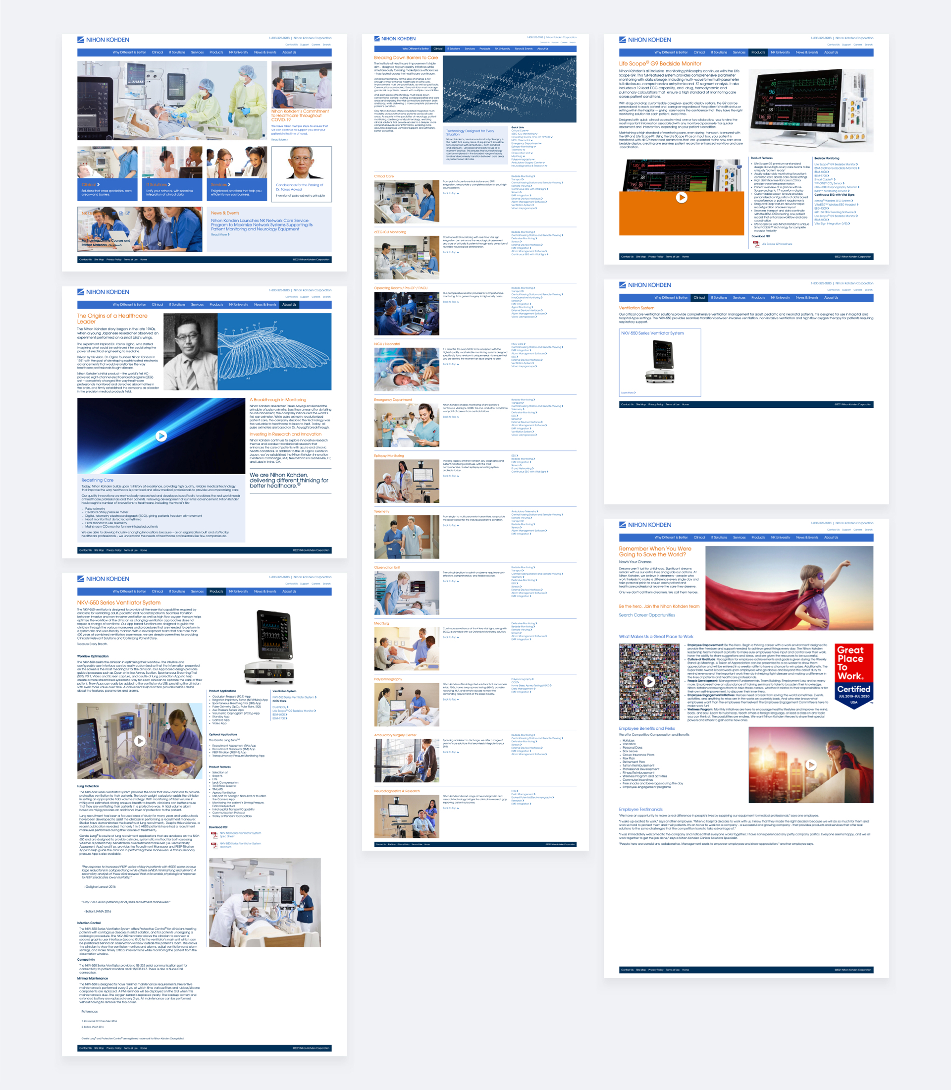
The assessment done earlier of Nihon Kohden America’s website gave my team and I the opportunity to examine exactly what content needed to be brought over from the existing site and what needed to be implemented. This was how the site map was put together and subsequently approved by the client’s own team.
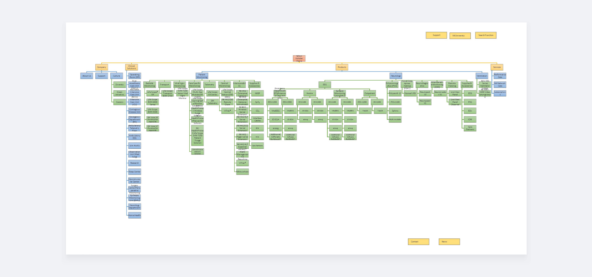
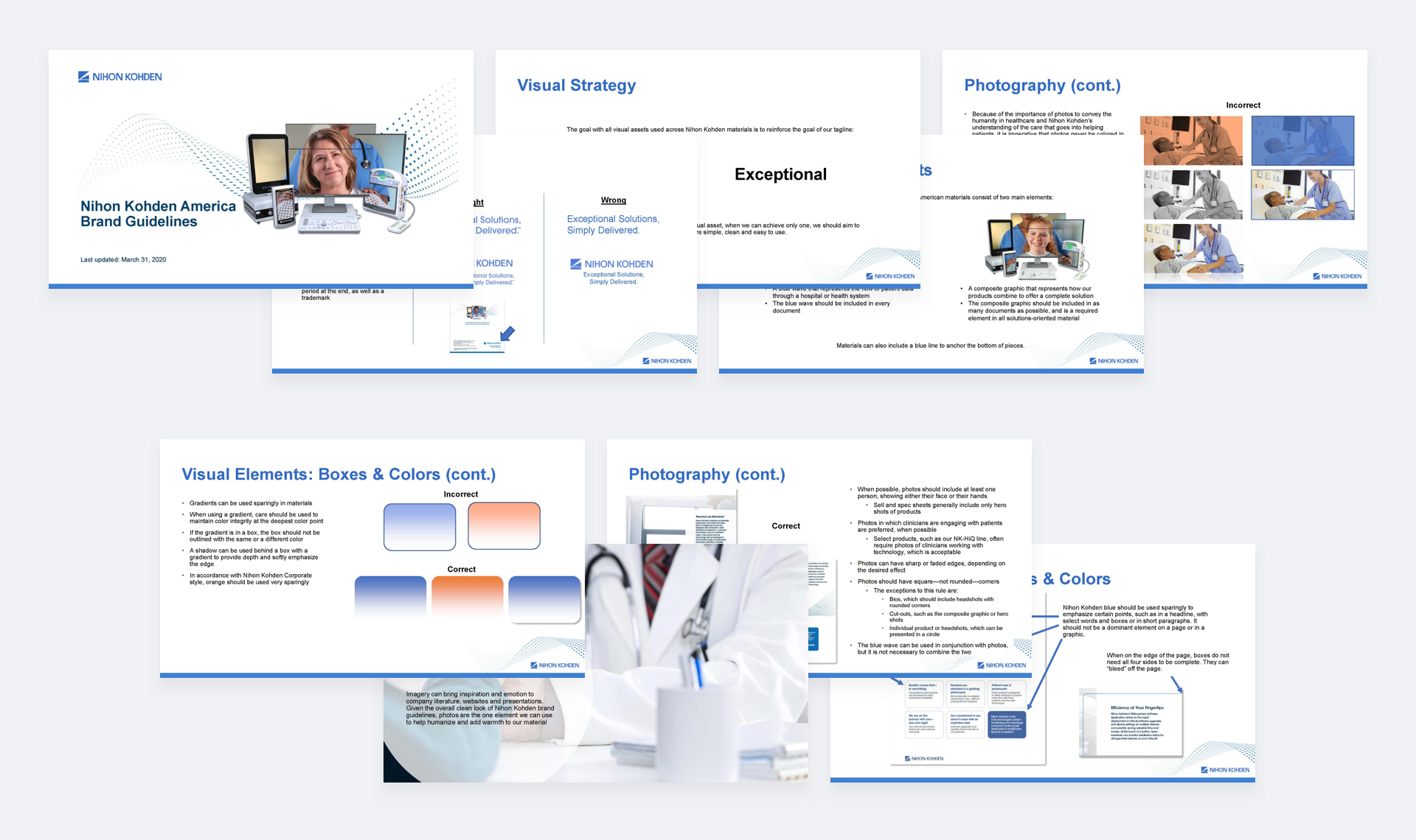
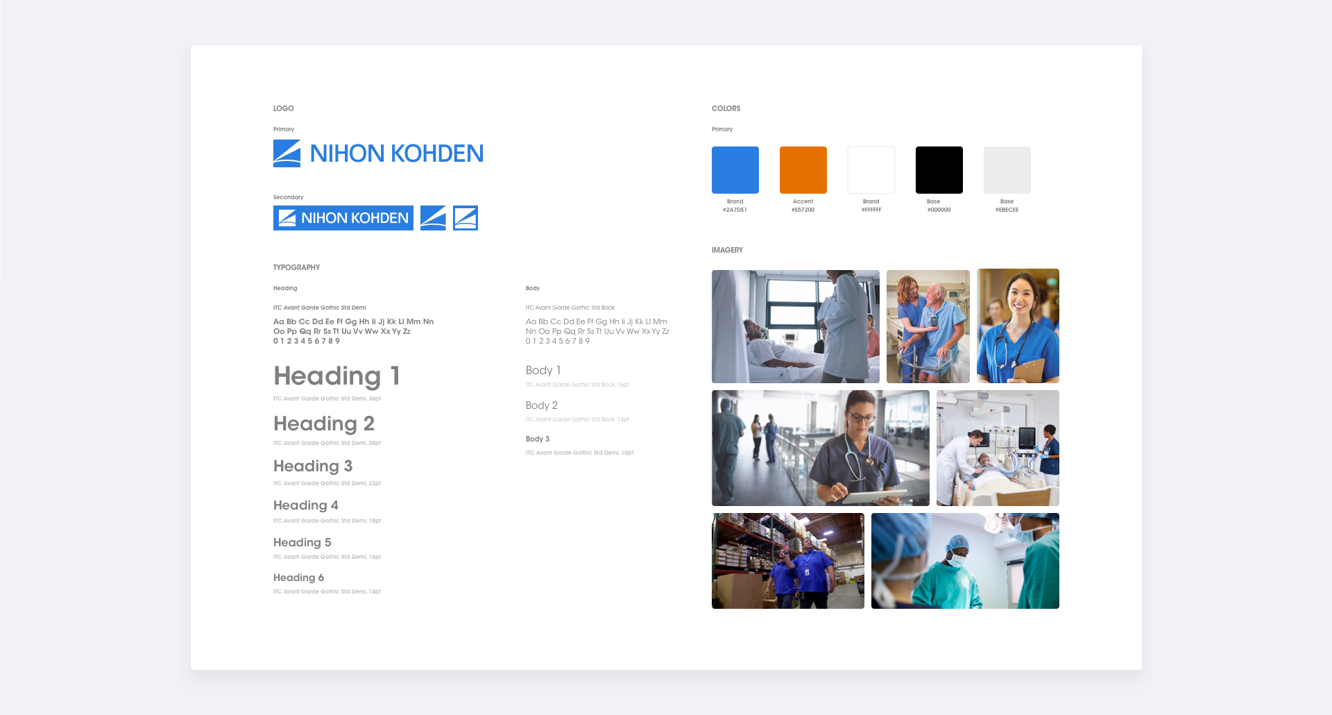
I utilized a recently revamped style guide and newly created print materials all supplied by NKA to establish the visual style of the site. I worked within the guidelines and essentially translated these points of reference to a more web friendly format. Below you can see a sample of some of the guides and elements that were used.
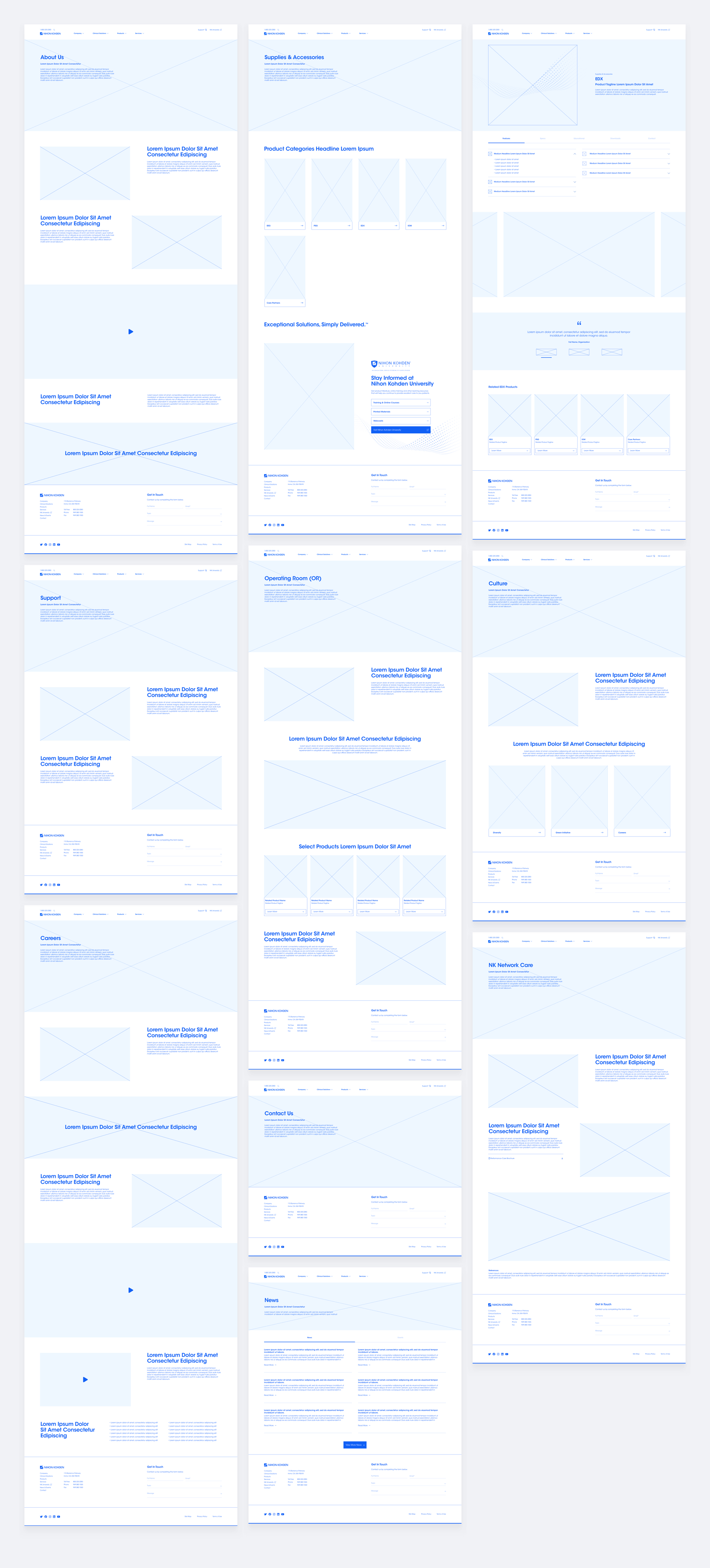
After I worked to define the visuals, I began to take the sitemap and
develop wireframes. This project would be concluding with a handoff of wireframes and
related visual assets, so at this point I was tasked with only focusing on select pages. I
would take these wireframes and fully design them, so as to present the client’s team with a
set visual direction for approval. Once these fully developed pages were approved, I would
then develop the wireframes for the rest of the pages on the site, for a total of about 90+
pages.
When developing the home page wireframe I focused on centering the conclusions I reached
from the reviews and research while keeping in mind the simplicity desired by the client.
The structure would call attention to Nihon Kohden America’s offerings in clearly divisible
sections to make navigation easier for visitors to the site. The sections act as easily
digestible blocks of content and would consist of an about, products, fields, clinical
solutions, educational, careers, and contact section. I sought to feature an educational
section because it was a program that NKA had found a lot of success with. Further
assessment at this stage led my team and I to incorporate news and testimonials seeing that
it would enhance the professional backing and active medical field and research elements
that the company could stand to benefit from.
The interior wireframes, selected to be the expertise and product pages, would be structured
similarly both for simplicity and practical reasons, given the large scope of the
project.
For the expertise page, I planned to utilize product category boxes and have it function as
an intermediate page for visitors to go from their field into the relevant product line.
Fields are obvious to the target visitors and thus wouldn’t need much, if any technical
clarification, letting them work as containers. Besides this focus, I proposed the idea of
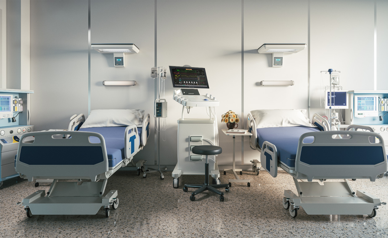
an interactive section of a 3D hospital setting with Nihon Kohden products placed in the
environment. This would allow visitors to immediately grasp the interconnected nature of the
products, seeing how they work well together.
The product page wireframe would have to obviously show the product and account for the
different aspects related to it. The flexibility to include or remove for example optional
accessories, features, relevant education information, etc. was key for future use. An
accordion was practical for this situation, given that the client also indicated their
preference for condensing information and reducing scrolling. I also planned an image and
video gallery section to demonstrate products in action in “real-world” scenarios. To hit
the point of interconnectivity again, I thought it important to include a related products
section. The planned flow would give visitors the ability to go from product to product in
order to further interest and inquiries and produce an increase in product sales.
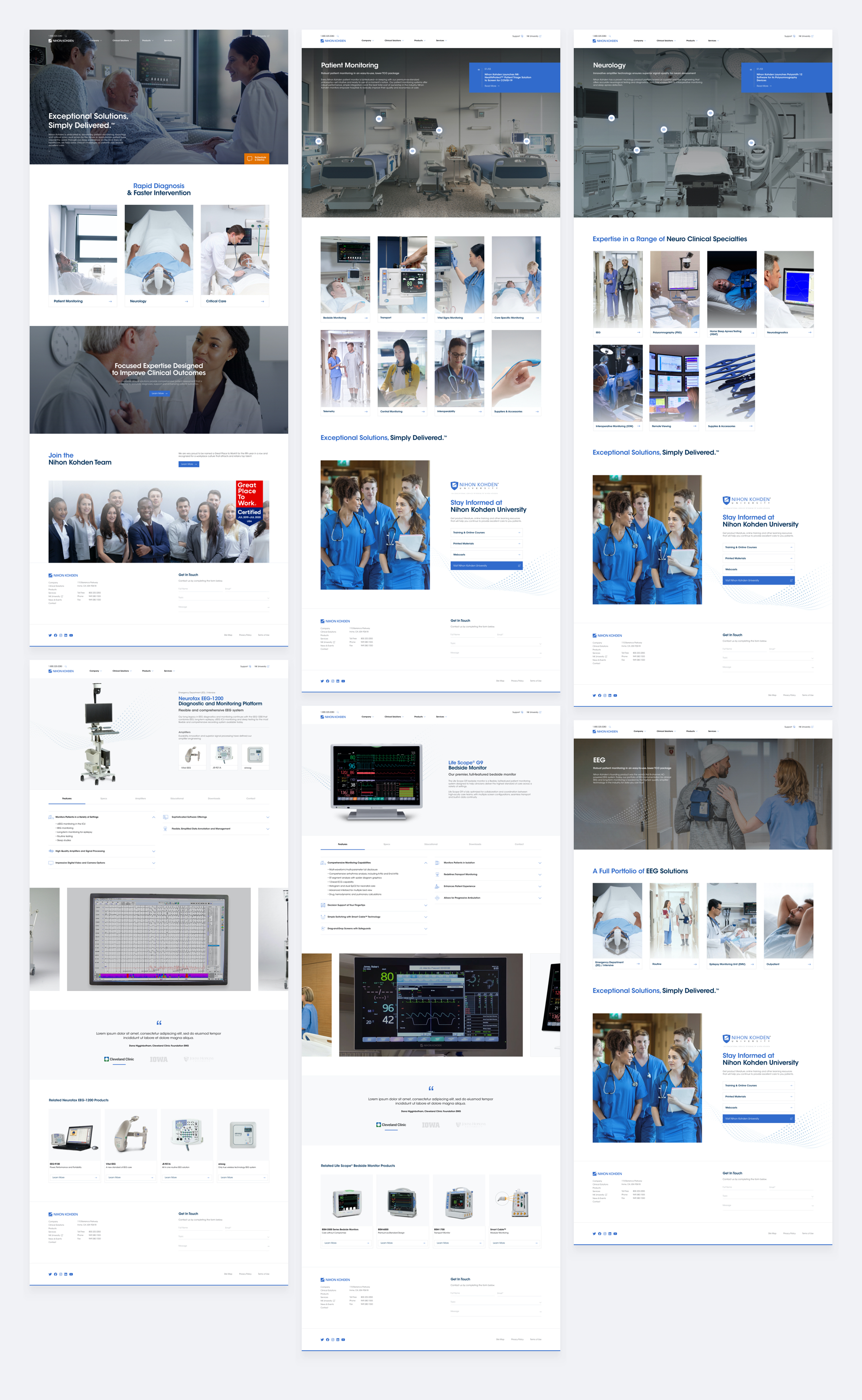
Once approved internally, I proceeded with taking the three wireframes
and designing them into full layouts according to Nihon Kohden’s visual guidelines.
In addition to my design, a second layout was put together by another member of my team so
as to give the NKA team another option. Initial reactions from the first presentation to
both concepts were positive, but the client ultimately decided to go with my layout. The
simplicity, clear navigation structure, 3D interactive demo, and use of large imagery were
some of the elements they preferred in my layout. On the other hand there were a few
sections they wished to remove and reorder including the removal of clinical areas from the
home page and making the 3D setting demo the first item on the fields pages, among the few
items. After three rounds of edits, the approved final designs, which you can see below,
were set and could now be used to generate the wireframes for the rest of the site.
As stated, I moved on to develop the 90+ wireframes in Adobe XD. At this stage in the process, copy and exact content was not finalized so my wireframes were only approximations. Taking this into consideration, I set up components in Adobe XD for template pieces the client’s in-house team could swap in and out as they saw fit. The final collection of files sent to the client included the select fully designed XD layout files, image and font assets, and the wireframes.
OReflecting on the project, there were certainly points that were
successful and points to improve upon.
The goals I listed out early in the process gave me concrete items to check off that were
not rooted in abstract questioning. NKA’s older website’s product pages typically consisted
of a small block of text with little supporting media for context as to the nature of the
product. The redesigned product pages touched upon all of my goals, but most importantly
brought products into focus. I utilized large product imagery and typefaces to make product
identification easier at first glance, and right away established compatibility with
relevant accessories. The rest of the page categorized key specifications and other
information, displayed in action videos when possible, and included a related products
section to further guide visitors into the entire NKA ecosystem.
At the same, I felt that discoverability for products was still on the lower end of the
spectrum. A problem that might have arisen from a desire for a clean design was actually
impacted negatively by oversimplification. The client liked the use of boxes for clinical
solutions to hide additional sub categories, but looking back on it, I don’t think this was
the optimal solution for products. Once products became further subdivided, it created a
technical problem that could make getting to products harder compared to listing them
outright. Doing it over, I would redesign sections in clinical category pages to list out
products under that category so users have one less click between them and their
endpoint.
These were just two examples of differing sides of the process but overall, I think this
project was a great learning experience. Concluding with a design handoff as opposed to
being involved in the development process was also new for me. It required me to enter a new
frame of mind that would make the transition as smooth as possible for the team picking up
development of the site. New scenarios and timelines such as these are what allow me to keep
improving my design process.