STG Logistics is a logistics company operating offering a wide range of
services and solutions in shipping and distribution. Operating the largest network of
independent facilities in North America, they are a leading logistics operator across ocean,
air, and land.
The project was a complete redesign of the company’s entire website,
intended to modernize the company’s image and bring it in line with their continuously
advancing philosophy. The redesign was seen through from initial design to final development
and launch.


To analyze and better understand what STG Logistics hoped to achieve with a redesign, I reviewed their old website. I took notice of layouts, site structure, content hierarchies, apparent competitive advantages as a company, and more. From this point I identified a few strengths of and challenges faced by the client through the use of SWOT analysis.
Strengths:
Weaknesses:
Opportunities:
Threats:
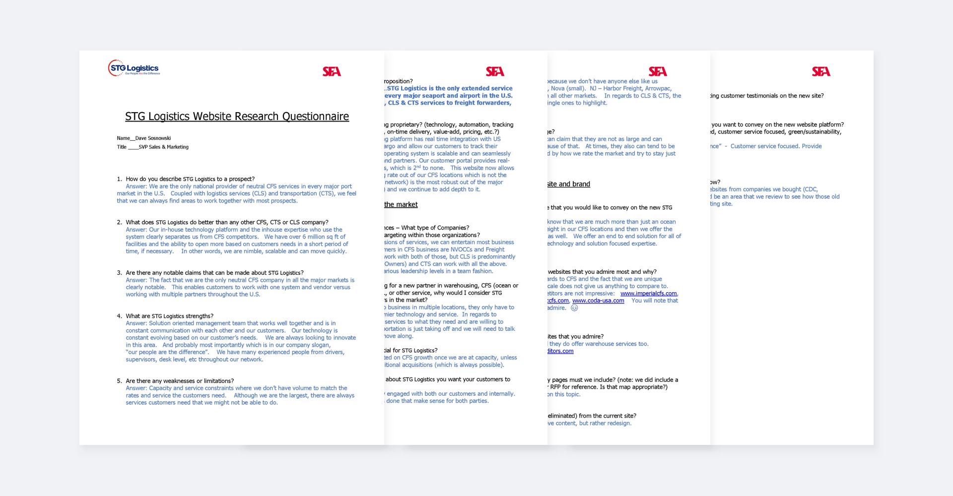
A questionnaire was supplied by my team at SFA consisting of design
and marketing questions aimed at gaining a better grasp at the STG team’s point of view. In
this instance however, those points of view were consolidated into singular responses as STG
did not want clashing directional objectives. Regardless, I was able to get key insights,
including some I listed below.
STG’s teamwork is the most effective part of its entire operation, as the company proudly
proclaims that their “people are the difference” in its slogan. They point to their
effective communication network as the reason for their speed and success in customer
satisfaction.
Their one system, one vendor approach to logistics differentiates STG from its competitors.
This is a direct benefit of being one of the largest operators, reducing external
communications down to fewer entities and streamlining service as a result.
CLS (Contract Logistics Services) and CTS (Customized Transportation Services) offer the
greatest potential for growth. CFS (Container Freight Services) is of equal importance to
the company however. Ensuring all three services are highlighted is vital in demonstrating
the company’s range and end-to-end capabilities.
Also addressed by the questionnaire was the matter of their target
audience. Audiences varied across CFS, CLS, and CTS, but overall encompassed US Non Vessel
Owning Common Carriers, Freight Forwarders, and Beneficial Cargo Owners to name a few.
Within these groups, STG is accustomed to approaching individuals at varying levels of
leadership.
The segmentation in audiences further cemented the need to preserve STG’s three sector
website structure. Customers doing business with STG Logistics are already familiar with
moving about their relevant spaces, utilizing known contacts and services and disrupting it
would be unfavorable. Keeping the tools they use for tracking and requesting service within
easy reach would be important.
The company also approaches competition in a similar manner, again sorting competitors into
one of the three buckets (CFS, CLS, or CTS). Take CFS, competition is strictly regional as
no other company is like STG nationally, and it includes corporations like Imperial, and
Empire in California and Arrowpac and CODA in New Jersey. Being even more numerous than in
CFS, the STG team did not highlight any notable CLS and CTS competitors, and only mentioned
that it was essentially the same situation.
The majority of competing sites did not offer much in the way of design guidance, as many
appeared dated, using uninspiring stock photography, lacked consideration for mobile
screens, and in one case even forgot to include a favicon. The more successfully designed
sites used more traditional designs, but the STG team made it clear they wanted to
experiment. They aimed to separate their site from the business aesthetics of those
competing in their space, especially using it as a way to reflect their constant
technological evolution.
Having reviewed the client’s website and different facets of its business, I formulated a set of goals to work towards when I created my design. As is typical with all projects, I made sure to prioritize these goals according to time, scope, benefits, risks, etc.
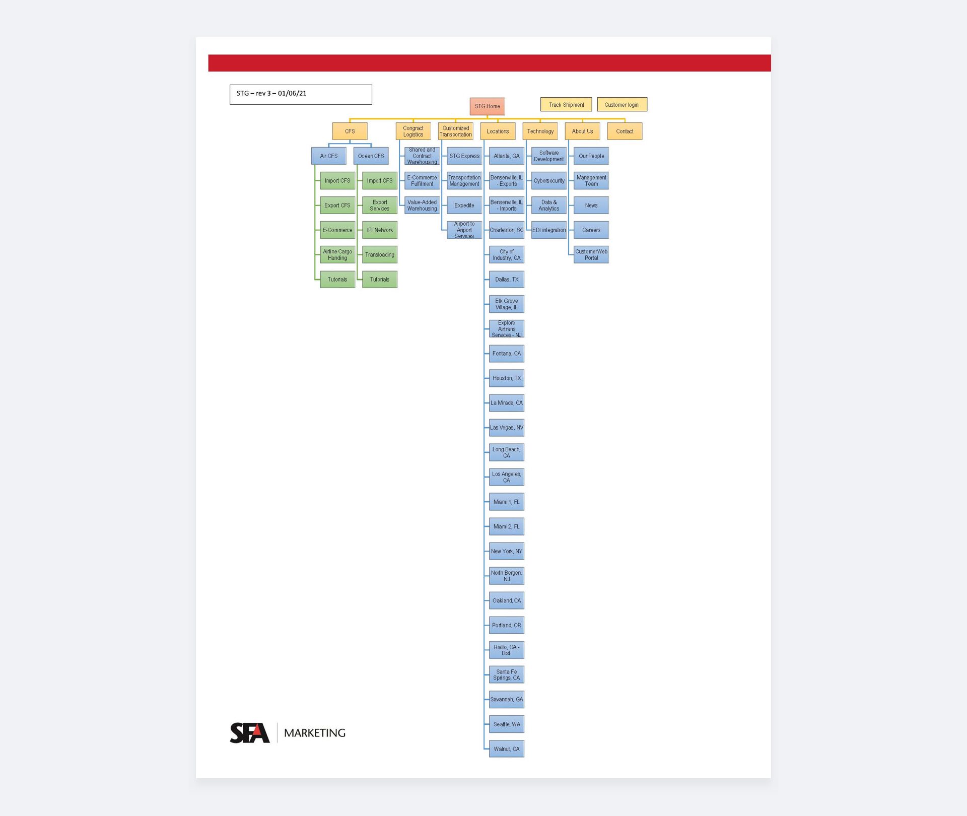
Concurrently, during the SWOT analysis I completed earlier, a site map had been put together by my SFA team in conjunction with STG. Like any other site map, it’s purpose was to determine structure, how pages would flow, what content would be migrated, what would be removed, etc. The final approved site map was determined to be as follows.
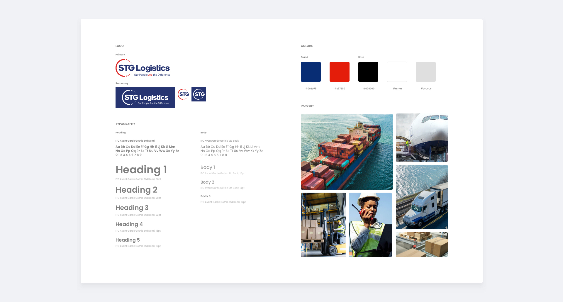
This time around, the client was unable to produce a style guide for use in the new design, but instead supplied a PowerPoint. Created by a different marketing agency, I was able to pull a few specific elements from it including font, colors, and icon styles. As it was the only developed asset provided by STG, being able to introduce elements where we saw fit was a freedom afforded to my team. Below you can see the styles generated for use in the website design.
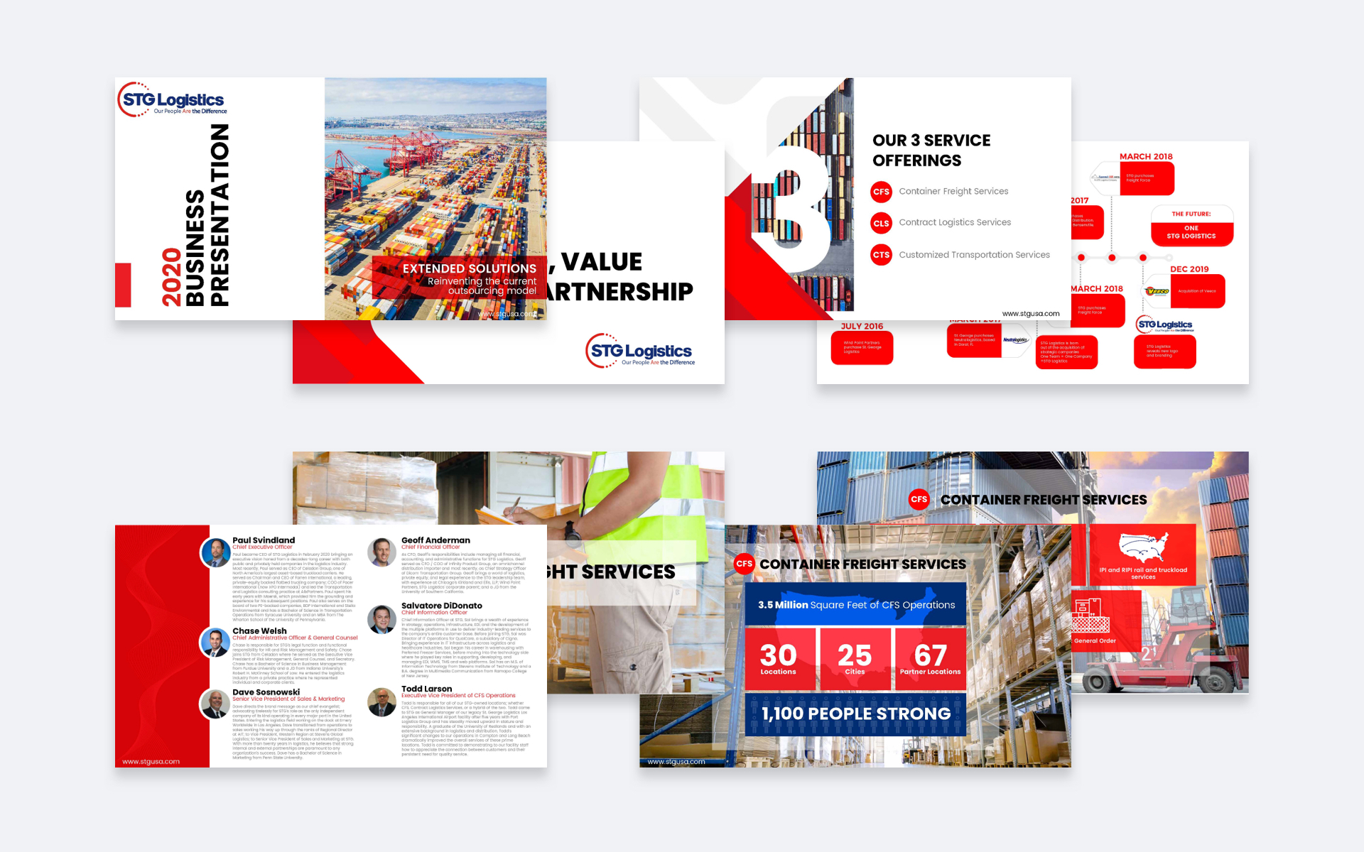
As part of the proposal drafted, my team at SFA Marketing was
scheduled to present two sets of two site pages, where each set is completed in its own
distinct style. The home page was selected as one of the two pages, being the first page
many see, the other was a CFS page. While the timeline did not call for wireframes, and the
first deadline was the presentation of two fully designed pages, I took the time to develop
them for internal use.
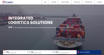
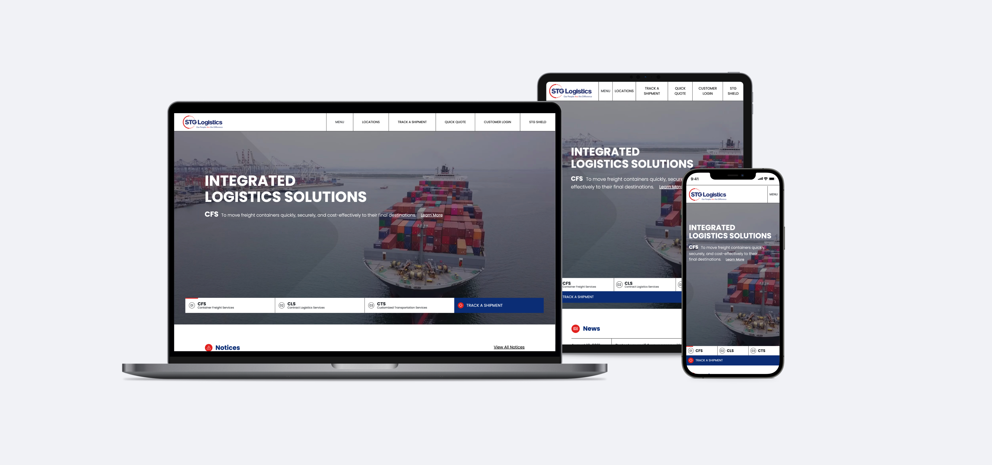
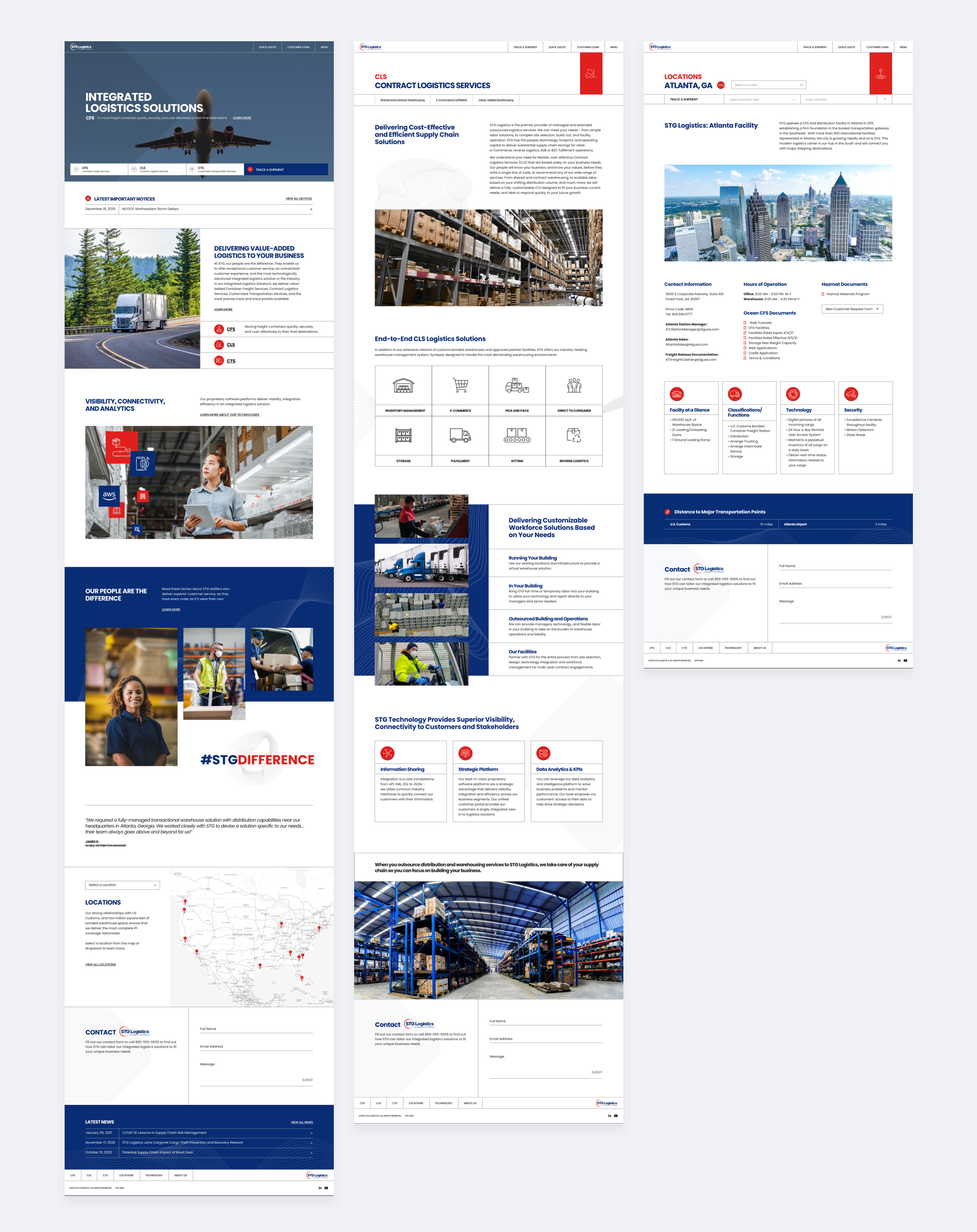
Being the page that makes the first impression on users, the home page needed to touch upon
STG Logistics’ most important offerings and corresponding information. To do so, the page
was broken down into sections consisting of a CFS, CLS, and CTS section, notices and news
section, about us, people, technologies, locations, and contact us.
As a way to quickly establish what STG does and its three main areas of services, I planned
to make use of a modified banner slider. The video would autoplay and slider navigation
would actually double as a way to get directly to one’s preferred area of interest as soon
as they land on the page.
Notices and news were placed immediately after, being that in the logistics space, changes
in hours, weather, and closures, to name a few, were all commonplace and needed to be
announced at a moment’s notice. To stress the importance of what they do, CFS, CLS, and CTS
were highlighted once again. Technology and employees were important distinguishing factors
and part of the #STGDifference equation. Locations, also being one of their most frequented
pages, was included, as visitors have to often familiarize and remind themselves of STG’s
many location details.
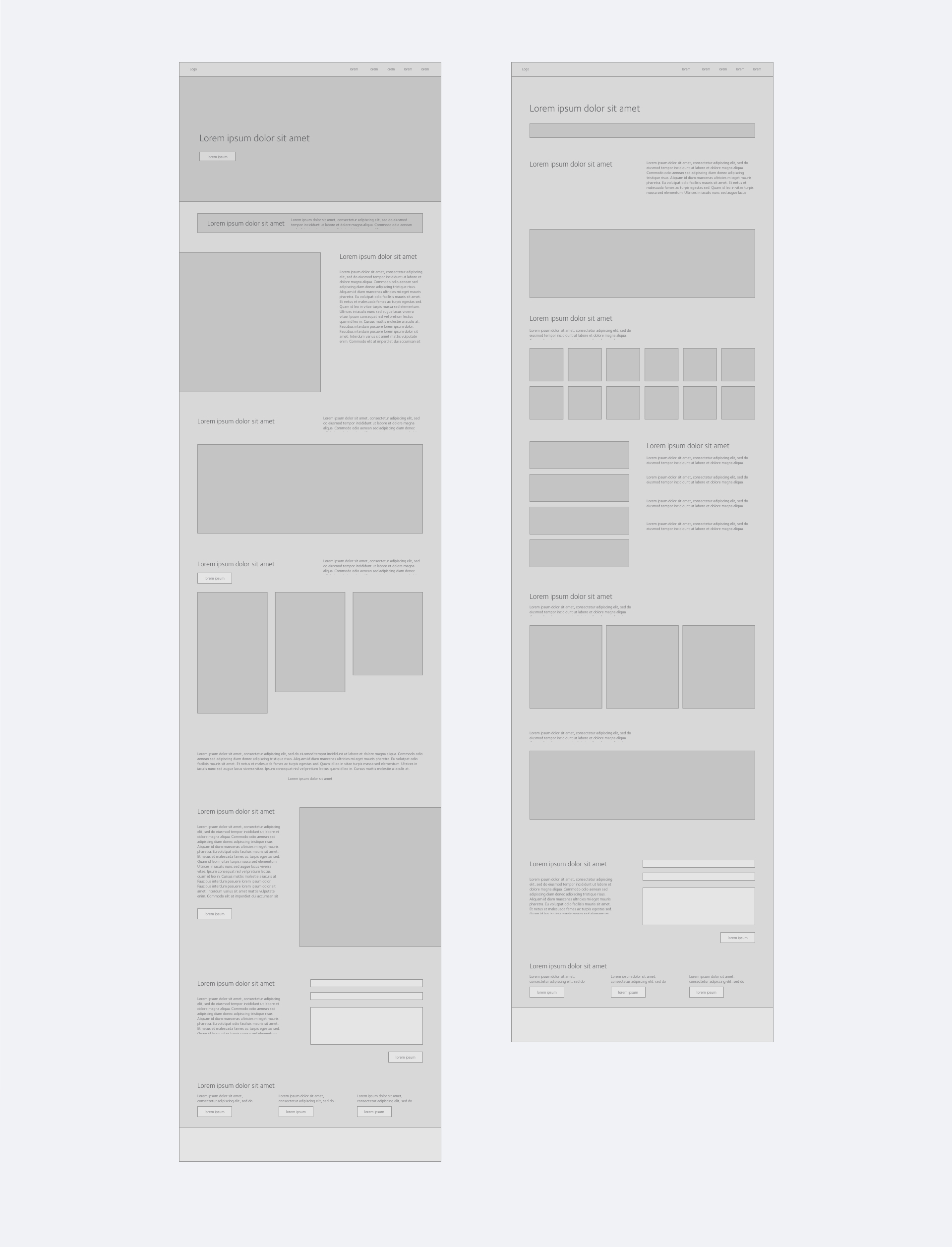
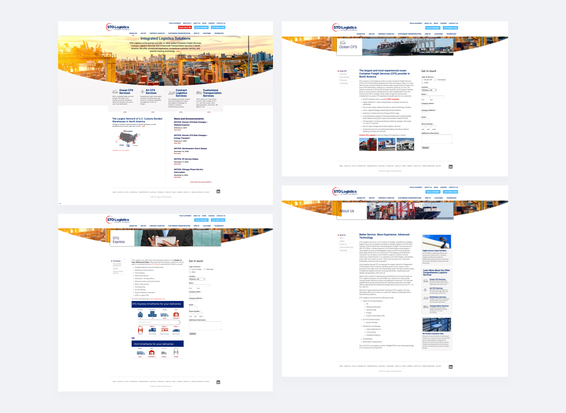
After I had formed a solid path with the low fidelity wireframe, I began to work on creating a design for the home page. I leveraged the visual guide I had created earlier, implementing the line of visuals and red and blue color scheme that STG currently utilizes, among other elements. At this point, a location page was determined to be the interior page that had to be mocked up. Lacking the flexibility of creating a wireframe, I sketched a few ideas and moved directly into designing in XD.
Concurrently, a second layout was also being developed by my team, but ultimately the STG team decided on my concept. Once the design was settled upon, the next phase within my organization was to code the home and interior location page, and once approved, move on to the development of the entire site. Although designs were still required for other pages throughout the site, the focus shifted to web development. While I handed off my initial Adobe XD files for my designs, I was still heavily involved throughout the development process. I assisted with the HTML and PHP coding and styling of pages using SASS, as well as integrating the template pieces within the Processwire Content Management System. This level of involvement allowed me to flesh out my vision for the site, while of course involving the feedback of my fellow team members, as well as the client. I found that acting as a bridge, balancing and connecting design needs with the time constraints and feasibility of development, was also useful. It allowed me to quickly make assessments on what needed and could get done in order to keep the project steadily moving forward.
websiteOnce “completed” (I say completed in the sense that all the pages were coded, given that it is the nature of any site to be constantly evolving and changing), I took a brief time to reflect on the process. Like any project, there were areas of strength and opportunities for growth. My team and I had successfully developed a brand for STG that prior to the website had been virtually nonexistent. With only select materials available to us, in the form of PowerPoints, I had the freedom to flesh out their brand further and modernize it from what their previous look was. Where I wish we had done better was better structure the content, especially in regard to the locations. Google Analytics had only been implemented for their site a few days before starting the project began, and so we had limited and skewed data for what the page flow and page visits were. Otherwise, we would have learned to what extent the location pages were visited and helped us avoid restructuring the navigation down the line and possibly informed our structuring of other pages, including the home page, more.